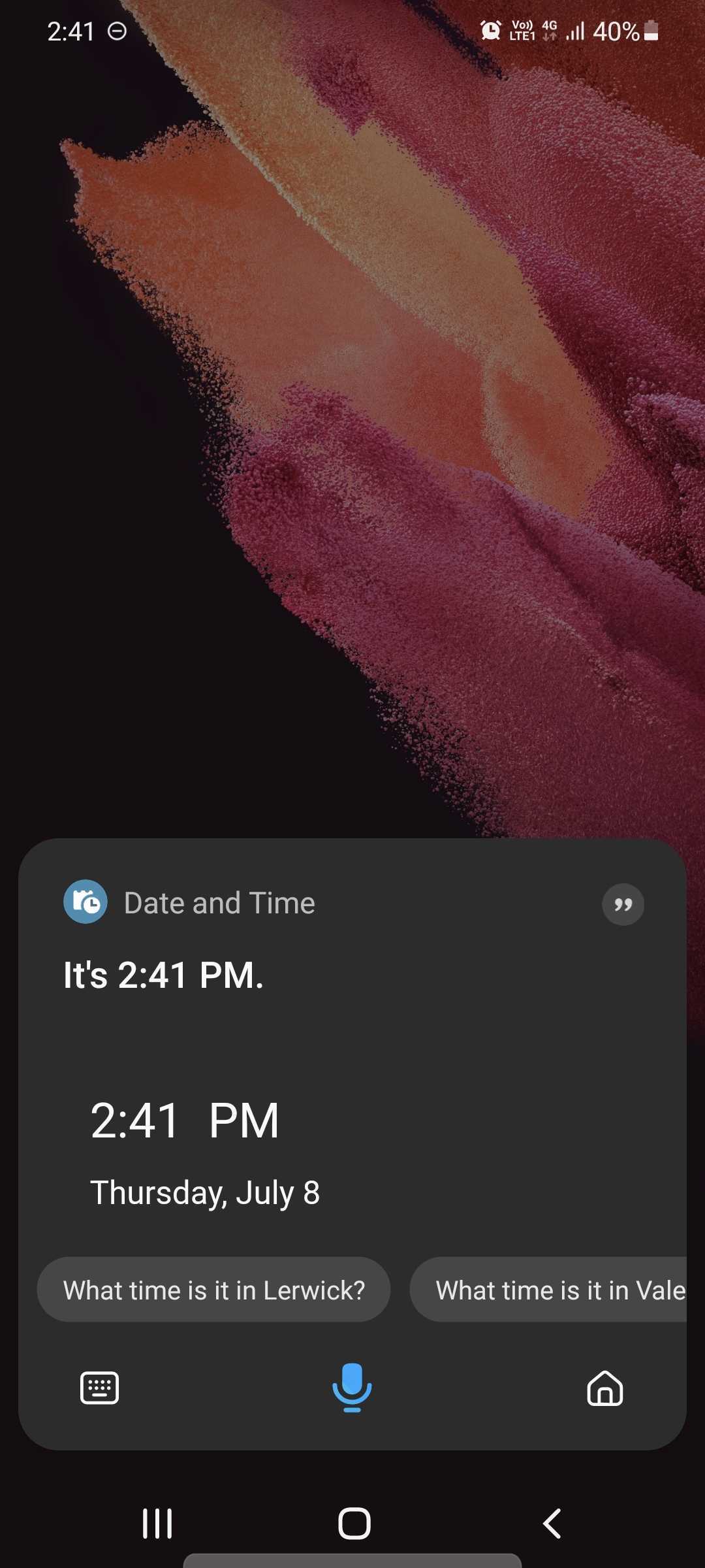
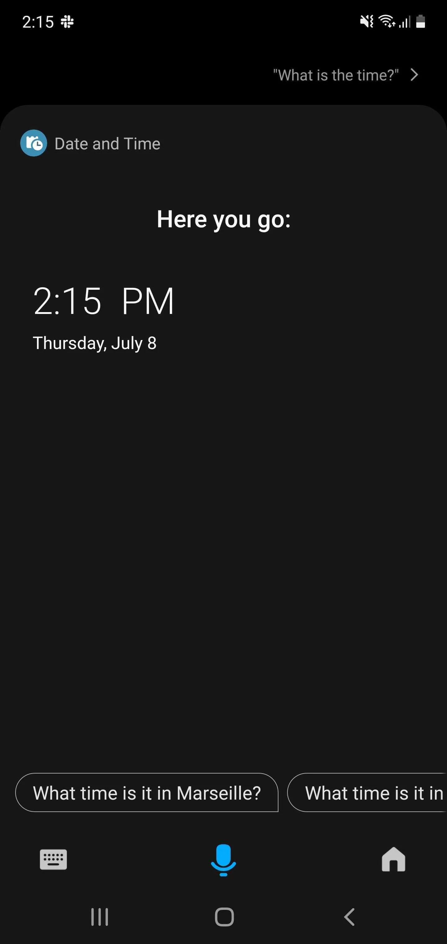
Samsung's personal assistant, Bixby, continues to evolve, despite the market certainly full of valid alternatives. The latest significant update has introduced some design changes, inspired by Google Assistant, such as opening it no longer full screen.
In fact, now the search results will occupy the screen based on the quantity, having the voice assistant anchored to the lower edge of the smartphone, much more in line with the atmosphere of Samsung's One UI, following the thought of having everything at your thumb's reach. .

 If you don't interact with Bixby further and ignore the result, the panel will disappear after 15 seconds, just like Google's service does. Also, after the more compact screen, Bixby will now show app-based suggestions if you have “Custom Bixby” turned on. Finally, there is a new possibility to add shortcuts to the home screen for voiceless use, suitable for particular situations.
This update, distributed via the Galaxy Store, certainly doesn't compensate for some of the major flaws still present, but it should make the service more enjoyable to use.


