Home Featured ,,,,, Apple continues its strategy of offering increasingly compact and functional IT tools in a coherent and transparent manner. And it also continues to develop input / output systems and interfaces that contradict those who insist that the company should converge iOS and macOS by ultimately using only one (and effectively making Macs like big iPads).
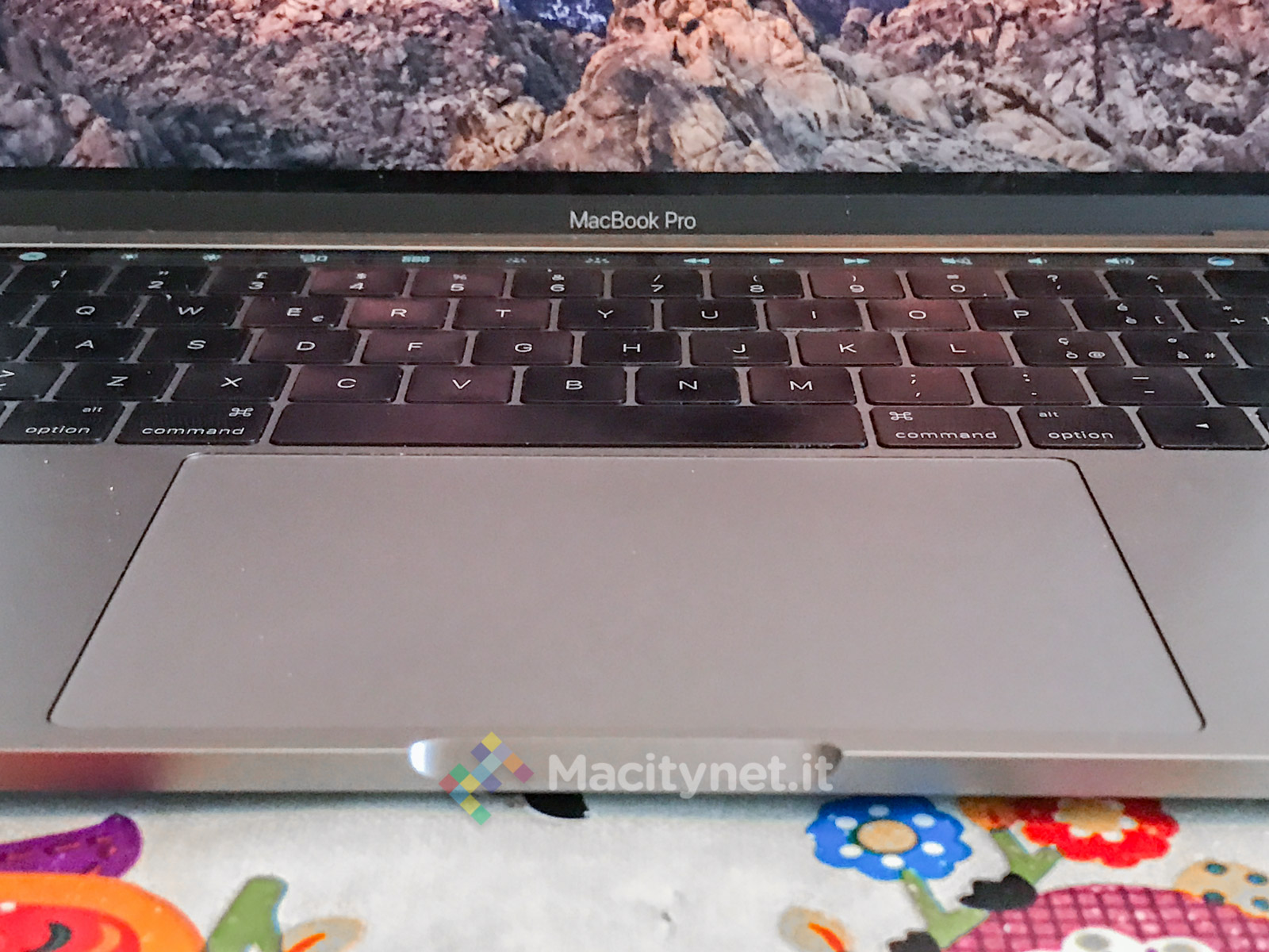
Instead, the two operating systems, which have the same Unix heart, thank goodness continue to use two very different interface systems. Furthermore, in relation to the different context and type of use, there are new peripherals and input modes. For the iPad Pro the novelty was Apple Pencil and to some extent the keyboard integrated into the cover of Apple. For the Mac, the novelty is the Touch Bar with integrated Touch ID as well as a super-generously sized “monstre” trackpad. They are two separate things, now we see them in detail during this test of the 13-inch MacBook Pro from 2016.
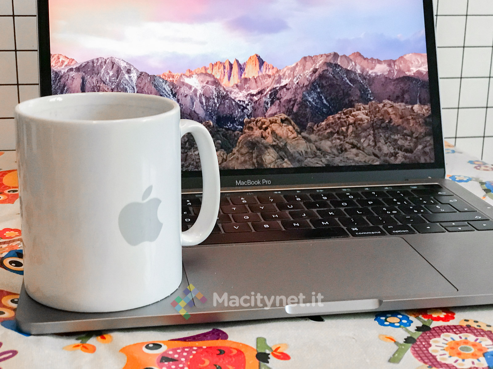
Let’s start the test The first thing to note is that this MacBook Pro 13, unlike the fifteen-inch model we tested here (first impressions of the OLED bar here), doesn’t come by itself. It also has its own Doppelgänger without the oled bar, which your reporter has reviewed here. A couple of concepts from that road test are worth recalling.
The first concept is this: “It is evident that the two versions with Touch Bar of both screen sizes [13 and 15 inches, Ed.] Are basically small variations of the same design. Instead, the 13 without Touch Bar is completely another machine: different interiors, different cooling, different ventilation system, different audio speakers, different motherboard, different memory (removable SSD, for example) “. In short, we have a MacBook Pro for the first time with a competitor within its own generation; even two competitors, if you consider that Apple still markets the 13-inch MacBook Pro from 2015, the one with the “old” design.
If the aesthetics and some hardware details remain the same (generously sized trackpad and second generation flat keyboard, for example), the performance theme (processors and integrated video cards are different), autonomy (batteries are different) and the usability of the OLED bar are instead of substance. So let’s start with the latter, the Touch Bar which also integrates the Touch ID.
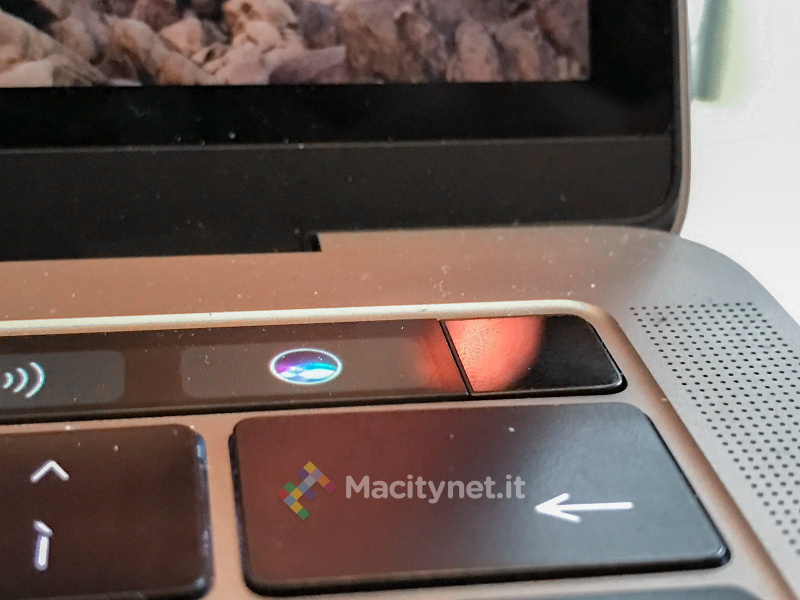
How Touch ID works The writer is a huge fan of Touch ID, less than the Touch Bar. The utility of having a secure computer, protected by a good password, is very high, but it is also annoying to have to enter the aforementioned password a thousand times. The use of a biometric system based on fingerprints does not add absolute security. Indeed, according to some experts, the fingerprint is relatively less secure than a “strong” password simply because the finger can be “forced” on the sensor, while the password is something we can legitimately refuse to reveal to anyone.
But in the daily use of normal people (not James Bond or Snowden) the fingerprint is a great way to have “strong” security and ease of authentication. The concept becomes different and even better if instead we think of Touch ID for the other uses designed by Apple: to provide an authentication system for the Mac App Store and then for ApplePay (not yet present in Italy, unfortunately).
With Apple Pay it is possible not only to make proximity payments with iPhone and Apple Watch, but also to make safer online purchases (there is no material exchange of credit card numbers or PayPal credentials) on sites that have this type of payment. digital active. Either way, it’s an advantage. Furthermore, it is used to “wake up” the Mac from the pause with the screen lock active and allows, if there is an active multi-user and another person has already entered his fingerprints in the system, to quickly switch between users. .
All of this works admirably and without hesitation. Unfortunately, not all alerts and Mac password requests are served via Touch ID (and in any case for security it is necessary from time to time to re-enter your user password regardless), however some applications are increasingly using Touch ID and this according to the writer increases the overall comfort. For example, 1Password, the app we prefer for managing our digital “secrets”, is compatible with Touch ID on both macOS and iOS (fingerprints are obviously registered for each type of operating system separately) and it is very convenient to use it in this mode.
Excellent idea, therefore, to have brought the fingerprint sensor (and the technology developed by Apple) in an original and complete way, without ruining the MacBook line with a door “somewhere” on the body. The idea of using it as a start button as well is really brilliant. And it explains why Macs now start up simply by lifting the lid.
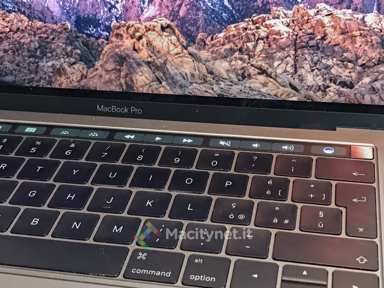
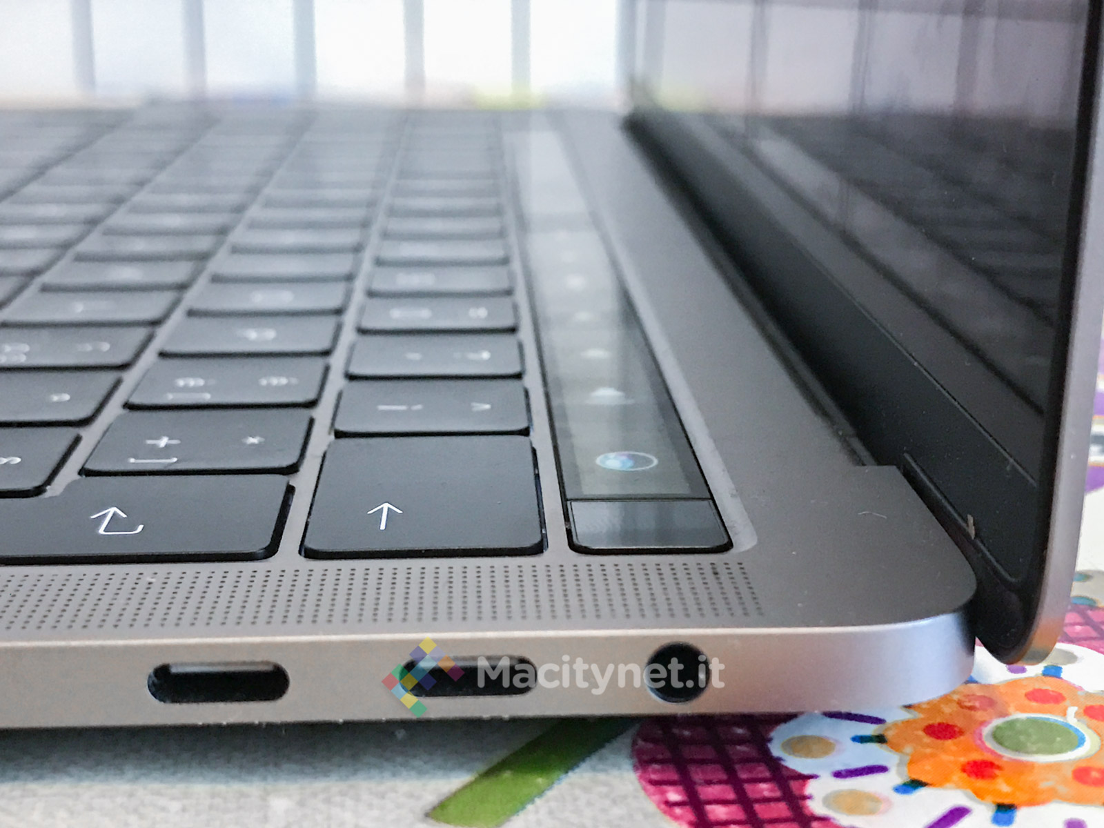
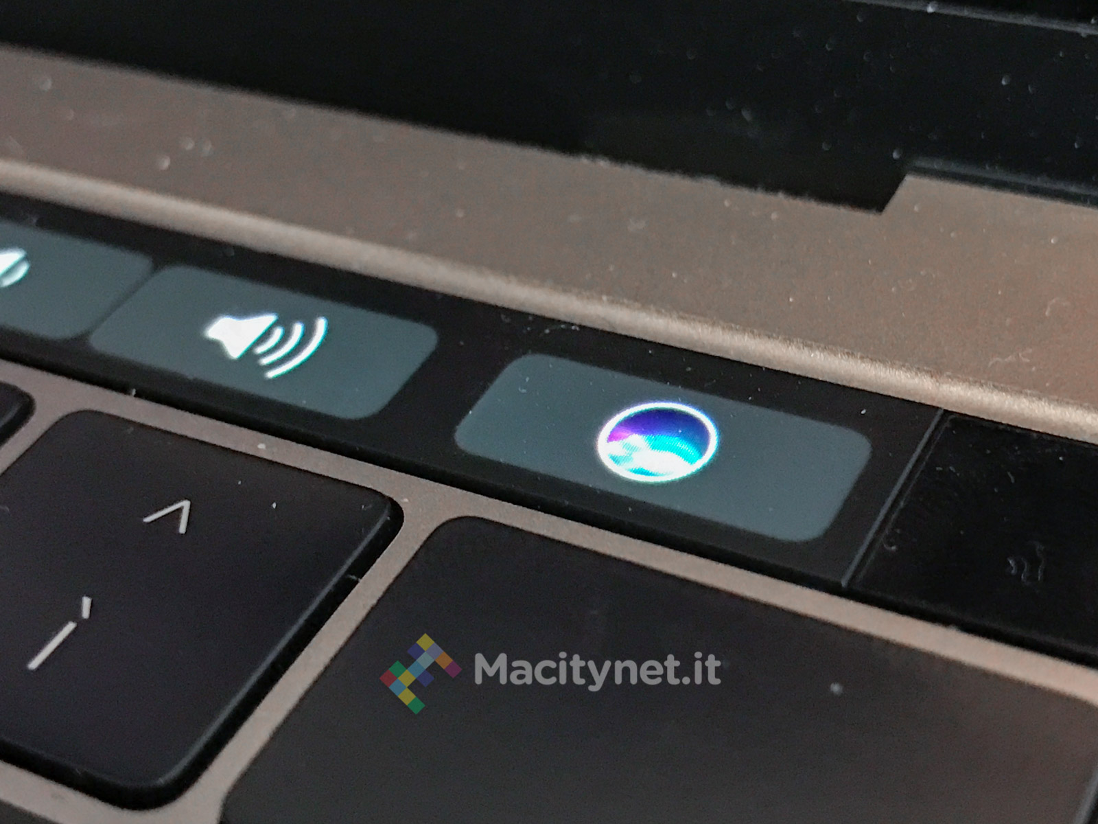
How the Touch Bar works As far as I’m concerned about the Touch Bar, the speech was different. We started out full of expectations and we saw many realized but not all of them. Let’s start with the fact that the F1 / F12 keys do not interest us, even if we have frequented them for longer than it is pleasant to remember: the first time we used them was to the right of the keyboard – which is excellent – of the Commodore 64 in 1983. But not we regret them.
Instead, we sometimes lack the physical keys for the most immediate adjustments of volume and brightness of the screen: the transition to the virtual keys of the oled bar does not offer as much satisfaction to those who are used to typing without looking at the keyboard and already suffers enough because, in bottom right, the cross of the arrow keys has been changed making it much more difficult to perceive by touch alone.
On the other hand, we find it interesting the possibility, thanks to the Oled bar, to have access to other features, based on the single app that is running at the moment. Not so much for the writing apps, with the formatting commands (in case it is more interesting to have the writing suggestions available: but, even here, let’s write the word first rather than raise our hands to go and tap on the rectangle right) as for other apps we have two features.
The first is to have a timeline available, as happens to those who make audio or video montages. And the Touch Bar does it very well. The second is to have a slide of choice or modification, as typically happens in photo management or editing apps. And here too the Touch Bar excels. These are two areas in which the expense (in Italy they are about 300 euros more than the MacBook Pro 13 without Touch Bar) to have this hardware feature on your Mac which is fully justified.
Here, too, the thing can be done well or badly: in our opinion it is better when, by placing the finger (by its nature “large” and inaccurate on a surface that is vertically about one centimeter) it serves to move the entire line of time forward and back faster and not to change the position of the pointer, with sudden “jumps” that become somewhat uncomfortable approximations when you want to do a precision job. This approach is seen well with YouTube and Vimeo videos (where the cursor moves to the point where you rest your finger) compared to, for example, Photos, which shows a photo and allows you to scroll through the list of photos below in a more controlled way. . In most cases both approaches are possible, just decide if you just want to tap or tap and move your finger along the time bar.
The autonomy of the MacBook Pro 13 Touch Bar There have been several controversies regarding the battery life of the 13 and 15-inch MacBook Pro. On the net, many have begun to complain about a rather limited battery life. The phenomenon is also found in the sample we have in test, despite the battery performs quite well compared to the alarmed reports coming from the network: seven hours of autonomy with a slightly stronger use than that used by Apple to calculate the autonomy. of its machines, without major problems.
The Mac arrived at Apple for testing a few days before the update to macOS 10.12.2 was released which, according to some (but not according to Apple), introduces various improvements to battery life. So we could not see the situation with the operating system in the launch version, 10.2.1. What we have been able to observe instead is that background activities have a strong impact on the autonomy of all Macs and this one in particular, which is particularly optimized to work with a very “light” battery compared to the past, also due to the further reduced form factor compared to previous MacBook Pro generations.
Therefore, many autonomy problems are solved by lowering the screen brightness a little, closing the connections that are not needed (for example, Bluetooth, if you are not using it), disconnecting external devices that are not needed (such as hubs for connectivity if we do not use any external device), to the limit by disabling the new optimized storage features on iCloud and the streamign of Photos, and keeping an eye on Spotlight indexing and face recognition in the background in photos stored on the computer ( we talk about these issues more fully in this article).
In all honesty, perhaps because we do not have an “extreme” use of this pro machine, it does not seem that autonomy is a problem in “light” tasks. That is, a more “casual” use of the computer. The battery takes the hit and quickly loses altitude instead with the heavier uses: video and image rendering, Photoshop filters, Maya modeling, more demanding video games. In this sector, for example, we tried the latest Mac version of Tomb Raider with good graphics results but with a rather reduced autonomy (and exuberant activity: throttle fans and very hot Mac body).
Then, Cyber Layman professional-readers who mainly use the Mac for CPU-intensive activities do not want it, but the experience as a user-journalist, who above all reads and writes, with this Mac is particularly rewarding. The screen is superb, with a truly unique brightness, definition and color range. And the battery, if you use the computer lightly, gives good satisfaction (certainly wasting a powerful machine for simple walks, but it is not that every day one has to edit videos in 4K if you are not a professional editor). For example, when we are writing with 80% of the battery available, Telegram, TextEdit, Termina, Safari (about twenty tabs) and iA Writer (six windows) open, Activity Monitor still indicates about 9 hours of autonomy, therefore above the average declared by Apple.
The company with the update has eliminated the possibility of seeing from the battery menu in the command bar the time duration of the remaining battery life because it is a calculation made on the basis of a dynamic situation that cannot be predicted. Nobody, not even Apple has a crystal ball: if the computer foresees with a certain type of use to have we put four hours of autonomy with 80% of remaining battery and the user decides to start a Photoshop filter, the consumption increases suddenly and obviously the temporal autonomy is immediately shortened to a couple of hours, while the percentage remains the same (let’s say it has dropped from 80 to 79%). In short, the indication risked being misleading: the data in any case is always present in the appropriate panel of the Activity Monitoring app.
The CPU performance of the Macbook The test of this MacBook Pro is deliberately devoid of “serious” benchmarks: in everyday use we do not proceed for tests but for functionality. The MacBook Pro is just fine for many different uses: from video editing to audio and image retouching, from gaming to compiling software source code or Latex text. It works and works well.
It is the mach ina less powerful than the 15-inch one but more powerful than the MacBook 13 without a touch bar. The feeling compared to the “brother without Touch Bar”, wanting to compare the two computers, is however different from what one might imagine looking at the specifications on the paper: there is no power gap and indeed, in some ways the Mac with a 2.0 processor GHz is more agile and smoother than this with 2.9 GHz Intel Core i5 processor and Intel Iris Graphics 550 card with 1436 GB of Ram (this machine is configured with 8 GB of LPDDR3 RAM at 2133 MHz and with a 512 GB SSD ).
The autonomy of the Mac without Touch Bar in the use of a month ago, substantially similar to what we are doing with this machine, was slightly higher (an extra half hour of autonomy) while for the pure power, it is a sensation probably due to factors of the individual configurations. What we don’t feel like saying, however, is that the MacBook Pro 13 without Touch Bar is a mere replacement for the MacBook Air 13 and this MacBook Pro 13 with Touch Bar is a computer that belongs to a completely different class.
The reality is probably a bit more complex. MacBook Airs had long since become computers powerful enough (compared to the new MacBook 12, at least) to be comparable to the entry level Pro. And the 13-inch version of the MacBook Pro, on the other hand, had long been “less powerful” than its own. older brothers from 15 inches for architectural choices and integrated graphics card only compared to the discrete one present on the models with a larger thumb drive. In short, in the complex geography of Apple products, there was a kind of convergence between the MacBook Air 13 and the MacBook Pro 13 which now becomes essentially complete: if we consider the two models with and without Touch Bar, in fact, the differences are very few. and the overall result is that of two substantially similar computers, which belong to the same class, with very few differences despite almost 30% more cycles in the version with Touch Bar. Hence probably the decision, also given the increasingly more form factor “Slender” of the MacBook Pro, to include all the laptops in the same family, leaving the “non-Pro” machine (ie the MacBook 12) the least performing processor of the whole family.
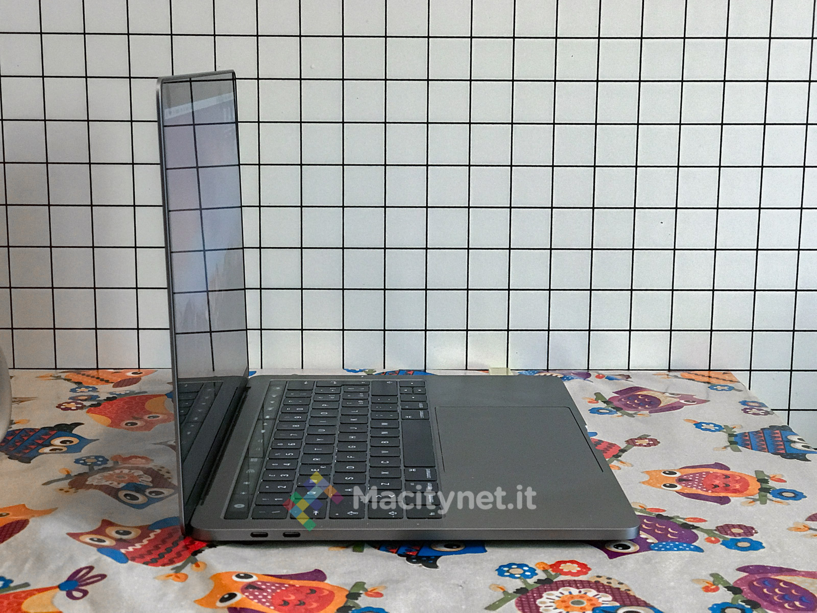
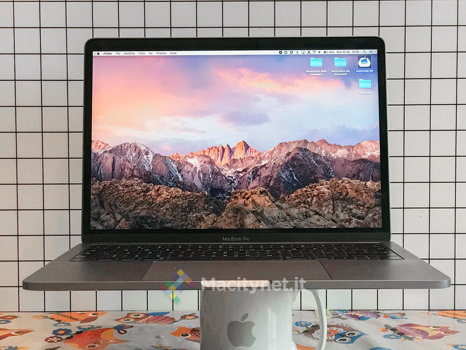
The other things on this computer We cannot fail to talk about the aspect ratio and the monitor of this computer. The body is very beautiful: thin, sleek, held with one hand and, even if only two hundred grams less than the previous model, it is substantially thinner and with an overall smaller surface and volume. Furthermore, the sidereal gray model is so beautiful that it makes you forget that the apple cannot be accessed (finally) due to structural limits: making a hole in the body to support the different material of the luminous apple would have compromised the solidity of the lid.
The screen is simply spectacular: there is no doubt that it is the best monitor currently out there on laptops. The keyboard, on the other hand, is not: the enhanced mechanism for actuating the butterfly keys, as we have already written, convinces the undecided but not those who find the keyboard uncomfortable (like myself), while it is a further improvement for those who already appreciate it.
The elephant in the middle of the room We come finally (and not surprisingly I left it at the end) to the elephant in the middle of the room. To the stone of scandal. To USB-C ports.
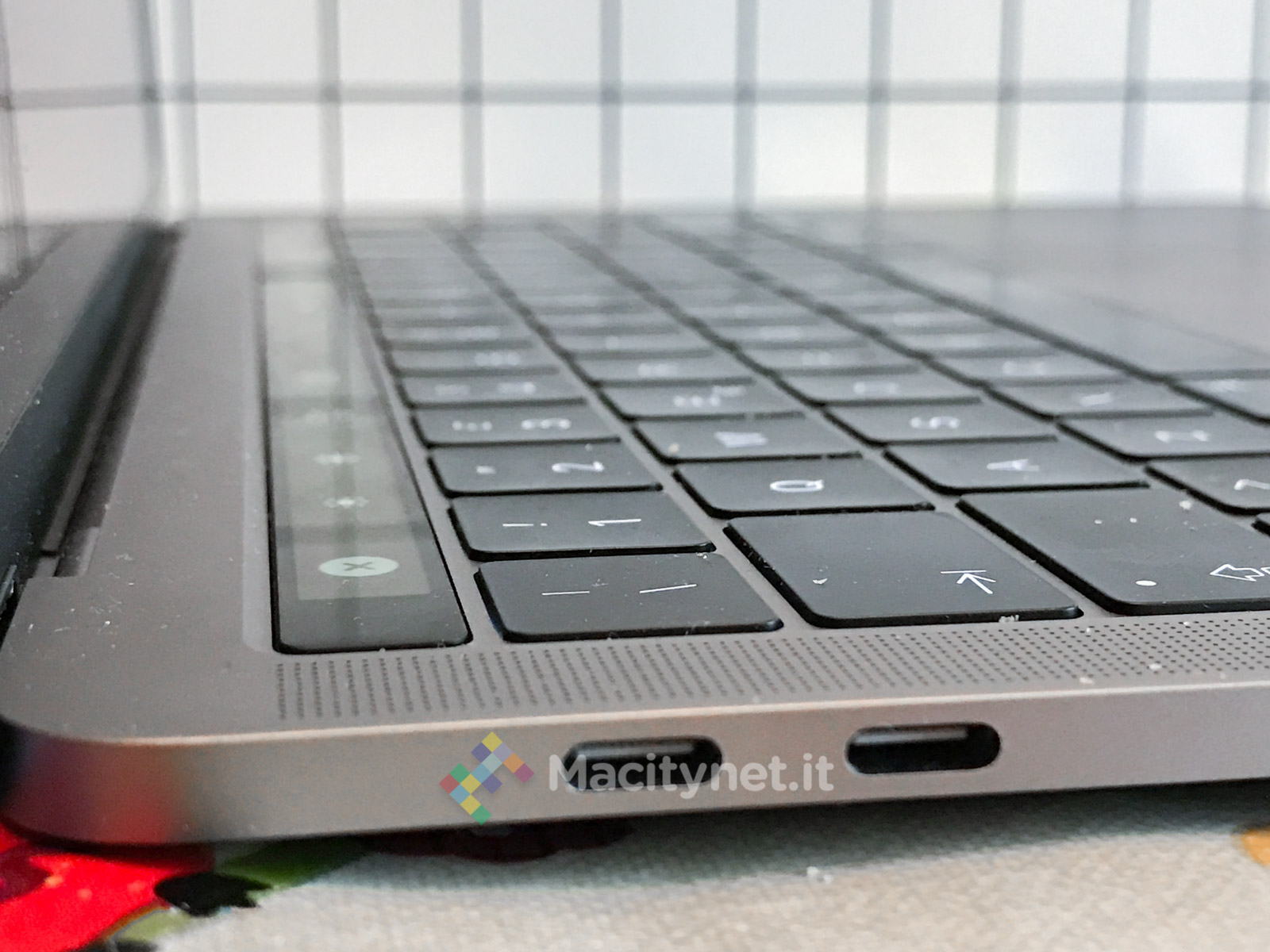
Well, there is no scandal and no elephant: USB-C ports are not a problem, indeed for the writer they have been a great opportunity. We have used them more often to charge the car than to do anything else, so having four, two on the right and two on the left (where there is also the audio jack) is just a “plus” because it allows you to attach the battery charger. both sides, regardless of what has already been connected to the computer.
We come to the “limitations” of USB-C ports, but only after having called them for what they really are: Thunderbolt 3 ports, which use the universal USB-C plug and are also compatible with all USB peripherals as well as monitors, external memories, external cards and dozens of other types of devices.
We had various adapters available in testing and, just to be safe, I also bought a simple USB-C Usb-A cable. In the end, I only used the small black Kensington dock that was very light and spartan with an HDMI port output, a VGA port, a USB 3 port, a GigaEthernet port but no USB-C pass-through port for charging (no need because there is any there are three more on the computer). The cost is far from spartan (eighty euros) and on Amazon some users experience multimedia connection problems that we have not had, indeed it has solved all the connection problems in general: the lessons during which we have to connect the computer or to the VGA or HDMI of the projector (I have made a dozen in the last few weeks), the Usb to use the new external disk with USB 3 port (it is a splinter) or to load the exercise from the students’ USB sticks done in class. Stop. The use of physical connections is less and less and some university projection systems that have just renewed their material are compatible with AirPlay and therefore you can go on the screen even without having to use a physical connection.
The other cable that was useful was the USB-C to Lightning, not so much and only to attach the iPhone and the iPad (and now also the AirPods headphones reviewed here) to the Mac as to connect the same devices to the charger of the Mac. Given the greater power of the battery charger (rather large) of the MacBook Pro 13, the various devices recharge quickly and without problems. When traveling this means leaving all the other chargers at home, and it’s not a bad deal for a simple extra cable.
In perspective, the “old-fashioned” use of the Mac always connected to the electric current and always with various accessories attached to the USB sockets we can say that it is almost completely finished.
In conclusion The new 13-inch MacBook Pro with Touch Bar has some indubitable strengths and some perplexities. The main strength lies in the form factor and the latest generation screen with extended color range: both make the user experience unique and very pleasant.
The Touch Bar introduces a series of useful methods of use especially within specific applications, while for the writer the Touch Id function is much more important and revolutionary for the way to use the computer: it will be difficult to get used to when you return to the “old “Personal Macbook Air in a few days after the test is over.
The battery life, the non-lightning power of the 13-inch series (compared to the 15-inch) and the updated but still “short-travel” keyboard, are the factors of doubt compared to an otherwise excellent computer.
There remains the very last variable to consider: the price. Apple starts here with a truly Pro price. Two thousand euros (with us there is the weighting factor due to the unjustifiable “tax” of the Siae, which assumes that all users of electronic devices copy music protected by copyright and therefore they “indemnify” in advance: an unlikely thing to tell it to a foreigner) are by no means few. Just make a few configuration changes (16 GB Ram, half Terabyte SSD, slightly more performing processor) and you exceed 2,500 euros to reach the three thousand range almost without even realizing it.
Is it a justified price, considering the positioning of this Mac as a “central” and not a “top” machine in the MacBook performance ranking? According to your reporter, no: it would have made more sense to have a single MacBook Pro 13 (compared to the current ones with and without Touch Bar) with the price of the basic model similar to that of the MacBook Pro without Touch Bar (1,700 euros).
The hope is that in the future Apple will be able to lower the prices of the next generations of these excellent machines and that, perhaps, in our country the Siae is based on the money that its protégés actually earn instead of going to fish them in the pockets of everyone else. .
Pros: form factor, Touch Bar and Touch Id, screen
Cons *: keyboard still too “flat” and poorly performing battery, high price
,,


