Home Hi-Tech Android World ,,,,,Fitbit's Charge has always been the Activity tracker par excellence: the first model introduced the heart rate sensor in the smart bracelets, the second a large display and the interchangeable strap while the Charge 3 continues the tradition through smartwatch quality and the presence of the App.
The responsibility on the shoulders of the device just announced is a lot, because to date Charge is still the best-selling model of Fitbit and the icon of this market: we kept it on the wrist for a couple of weeks, let's see how it went.
Charge 3, the review
First contact
We had the first contact with the Charge 3 first at IFA, and then at the Italian presentation, but it is only after the latter that we were able to put it on our arm for real because seeing it and trying it are two very different things.
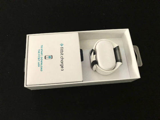
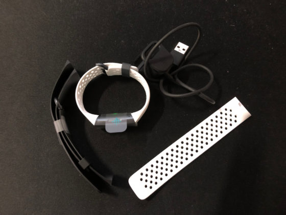
The model we tested is the Special Edition with white rubber strap: the package, sober and functional, opens showing the bracelet already assembled, but in the same box there is a longer part of the strap for those who, like the writer, have a generous wrist and a second black strap of the same material.
In addition to this a small brochure and a USB charging cable, which can be connected to the computer or to any power supply via USB-A (we used JBL's Horizon alarm clock).

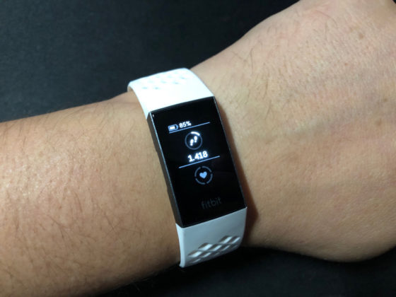
Once on the wrist, the novelties compared to the Charge 2 model emerge clear from the beginning: the shape is more tapered and the central part, where the computing center resides, fits more on the wrist than before, offering better contact.
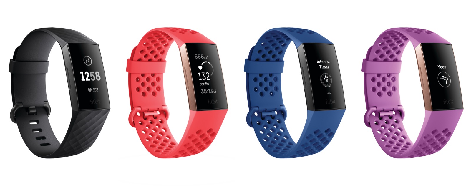
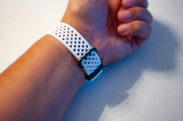
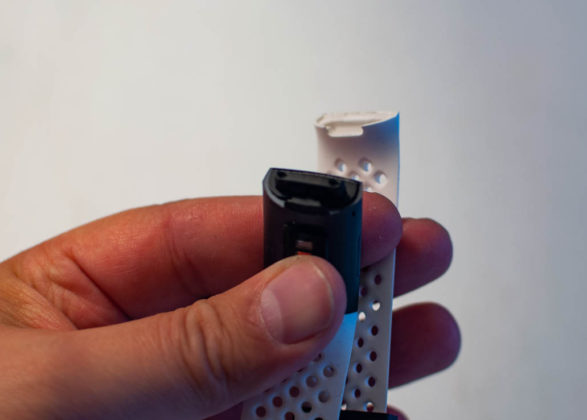
The strap supplied with our model is very comfortable: the numerous holes allow the skin to breathe and also a perfect attachment to the back, instead of the usual separate holes of the classic straps. As for aesthetics, however, opinions were mixed: the writer likes it, while friends and colleagues are divided on different opinions. Fortunately, changing the strap is a really simple operation: Fitbit had us a little worried with Versa in the operations of changing the strap, quite delicate, while in this new Charge 3 the change is a 5-second operation that can also be done with one hand. alone.
Once on the wrist, however, the model is very light and basically it almost seems not to have it: even if it is one of the largest Activity trackers on the market, on a male wrist it doesn't hurt even on the right, and it works very well on the left or right. place of the clock.
Ambitions
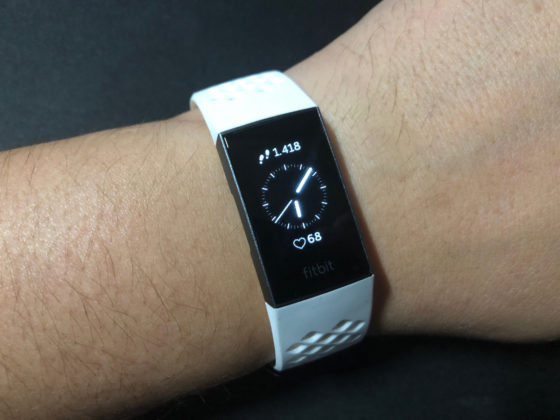
The thing that you notice immediately once turned on is undoubtedly the large monochrome black display: with such a large display for an Activity Tracker, there are smartwatch ambitions, especially for the use of the Apps, as we will see.
Normally the display is able to show the time, accompanied by numerous information, both in analogue and digital form: in this regard, we give our applause to Fitbit for the beautiful large display with Bodonian characters, practically unique in the whole sector and that from a romantic touch to a device that could be seen as too hi-tech.
On the other hand, we would have liked a display without the time, which appears redundant for those who wear it to the right with a clock on the left side.
Compared to the last model, the side button disappears, now replaced by a haptic button (an operation probably made necessary for waterproofing, as we will see) and the possibility remains to interact directly with the display thanks to the touch controls.
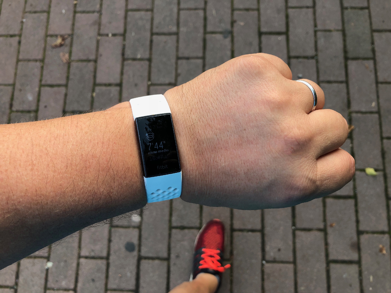 During physical activity, the dial shows the main information relating to the activity
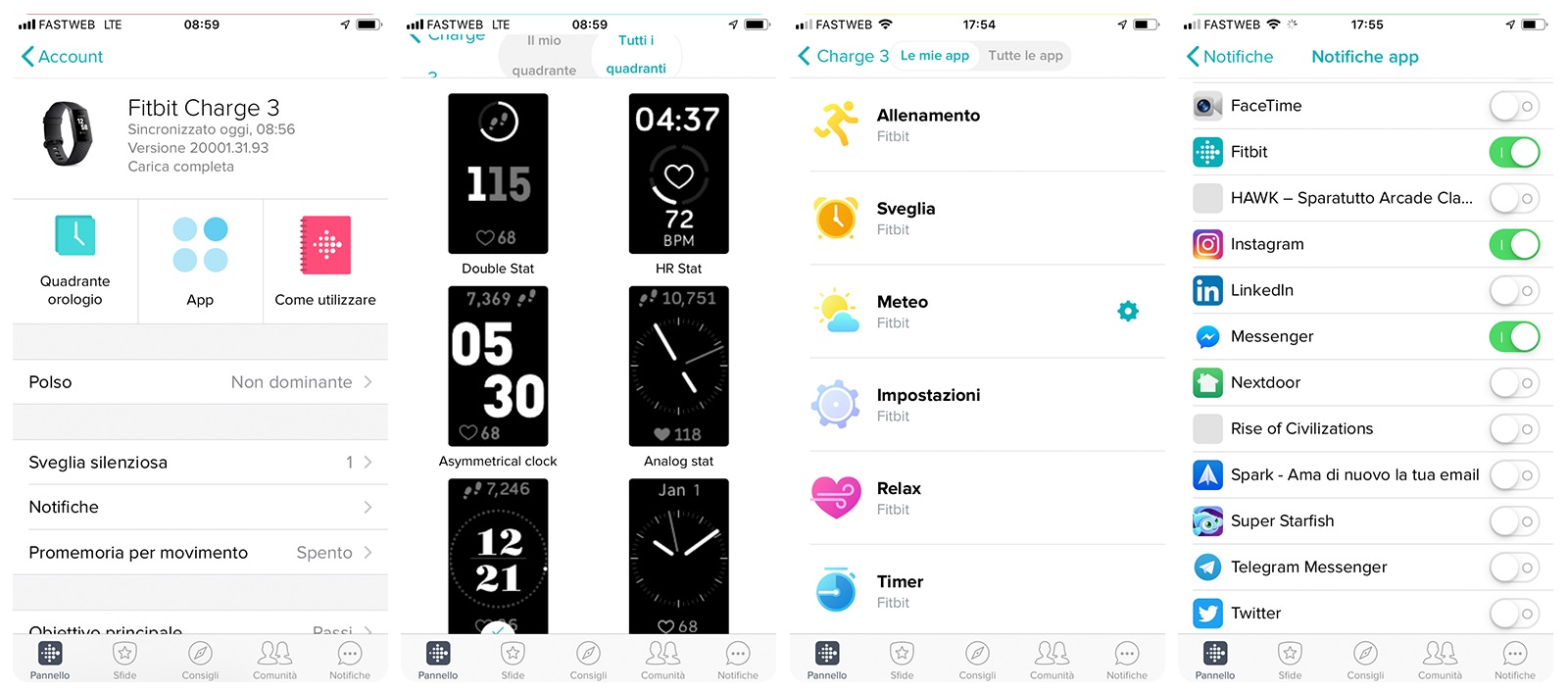
The big news of this version, from the software point of view, is the presence of App: Training, Relax, Timer, Alarm, Weather and Settings are functions advanced enough to put the Charge 3 with ambitions from a higher category, that of smartwatches, even if the lack of a color display and a dedicated App Store are noticeable.
Fitbit management told us that an App Store will not arrive within Charge, but other Apps will arrive in the future, developed by Fitbit or third parties but only through firmware updates from time to time.
The ergonomics of the display have been studied very well: the Apps can be found by scrolling to the left, the numbers of the day's readings scrolling up, progressively while scrolling down we find the App alerts, which can be selected via the App Fitbit.
Charge 3 is therefore not a smartwatch in the strict sense of the term, but the shape, the possibilities of the display and some types of display make it something very close and perhaps the most hybrid model between Activity Tracker and Smartwatch in the market from the point of view. functional (although on this statement we leave the opinion to the readers because the categories are not very well defined and subject to points of view).
1 of 3 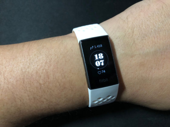
In the water, finally
Charge 2 was resistant to splashes and dust, and it seemed only two years ago already a good result for such an advanced model but this offers full waterproofness, so much so that it can also be immersed in water (even salt) without problems.
Which means that you wear it and never take it off, neither to take a shower nor when you go for a run, if you play soccer or even for a swim in the pool (if instead you dive maybe yes, but in that case use something else).
 Notifications are an integral part of the Charge 3 experience and in fact in the large display we can read most of the messages, even if it is not possible to reply from the iPhone
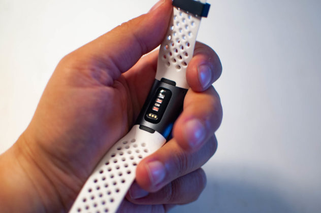
On the back of the bracelet, in contact with the wrist, the new heart rate sensor always refers to the PurePulse technology: the novelty here is that the Charge 3 uses the same sensor as the more advanced Versa and Ionic models, so an extra step on the scale of the accuracy compared to the previous model, but at this point also compared to Alta HR.
There is no GPS inside, which the Charge uses in sharing with the smartphone, but as regards physical activity sessions there is a proven automatic activation system that records the states of activity from those at rest, proposing a very accurate X-ray of the day: in some running sessions the Charge 3 offered to activate the Running function, but even declining, the activity was recorded the same (without GPS) as an important physical activity.
1 of 6 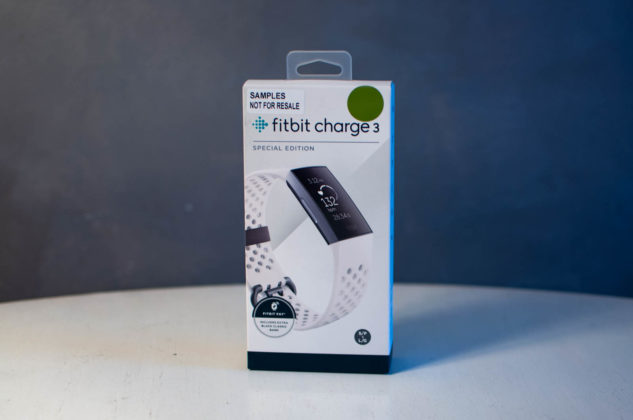
Obviously, by activating the function the tracking is continuous and the detection functions are good, including the automatic pause (which however did not always work) and the vibration at every KM (which must be activated manually directly on the display).
Ultimately, in the Special Edition model subject of this test, the Fitbit Pay function is integrated, which allows you to pay by simply touching the bracelet on an enabled reader.
This function, linked to a small number of banks at the moment but which, we are assured, will have two other important players in the market before Christmas, is very convenient for small on-the-fly payments: Metro, bus, cinema or, why not, a drink. fast during a walk or bike ride, when we usually don't have our wallet behind.


The Fitbit App
We have already talked about the Fitbit App on several occasions: the app is the same as all the other Activity Trackers and Smartwatches of the brand with the fundamental characteristic of offering a single portal for each request (device data and preferences), an inverse habit compared to the main competitors of Apple and Google, which instead prefer to offer individual apps for every need.
The App takes care of synchronizing all data with the bracelet, sending the data to the Fitbit cloud, and returning it to the user from the smartphone or web browser display already filtered and optimized, with recommendations based on the average of users classified by gender and age.
On this point we would like to pay particular attention: the beauty of Fitbit is certainly the hardware, but the thing that offers the most added value is undoubtedly the software, because it returns an overview of the data that is not only personalized and profiled, but also useful to the user.
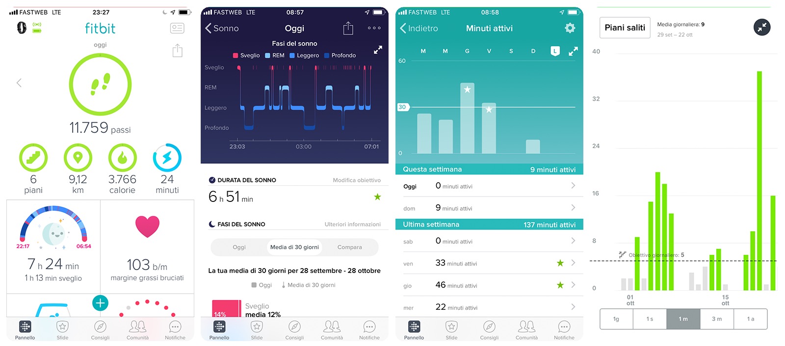
The App provides advice on everything from food use to movement motivations, a little social media for Fitbit users to some step count games, to what is probably an almost exclusive feature for the brand, the 'sleep analysis.
Many do it, it's true, but Fitbit's sleep analysis algorithm is probably the best on the market today, thanks to the fact that Charge 3, like all other bracelets and smartwatches, offers a week's worth of sleep. autonomy, on the other hand because the analysis is detailed and painstaking, based on three layers of sleep (plus one of wakefulness) and correlated averages.
The only real flaw we see in the App, whether it's Fitbit's fault or not, is not known to us, is in a closure to the outside world that sometimes appears annoying: for example, it would have been interesting for those coming from products like Apple Watch being able to import all the data into the Fitbit database and on the other hand also the possibility of exporting them externally to keep an important history alive. At the moment this possibility is only active with the Strava App, a little bit considering the great variety of systems in circulation.
Small (in) compatibility
During our tests, carried out with an iPhone 8, compatibility has always been very high, in the sense that the smartphone has seen the bracelet correctly in a constant way and without any kind of problem. It should be the same with the Android world, although in this case we were told of an exception regarding Huawei models (such as the recently unveiled Mate 20 model).
Basically it seems that Huawei has a compatibility problem with some wearables (including the Charge 3) due to the way the Bluetooth of its devices works, which is why we advise users to carefully evaluate the compatibility (which for Fitbit is listed in this page) before purchasing.
Final thoughts
Lightweight, with a generous display, with interchangeable strap, heart rate control, touch functions and integrated apps and, above all, with a complete data system from every point of view, Charge 3 appears today as a formidable Activity tracker. The price is important (and also the shape), we admit it but those who do not want a smartwatch and prefer an Activity tracker, to be combined with a classic watch, will find in this model everything you need, often even quite independently directly from the bracelet display. without disturbing the App (quite unique factor in the smartband market).
Pro : • Powerful, light and comfortable to wear • Large touch display • Water resistant and with extensive customization • The App is the best on the market
Against: • A greater opening of the App towards other systems would be welcome • A little expensive
Price: 149.99 Euros (169.99 Euros for the Special Edition version)
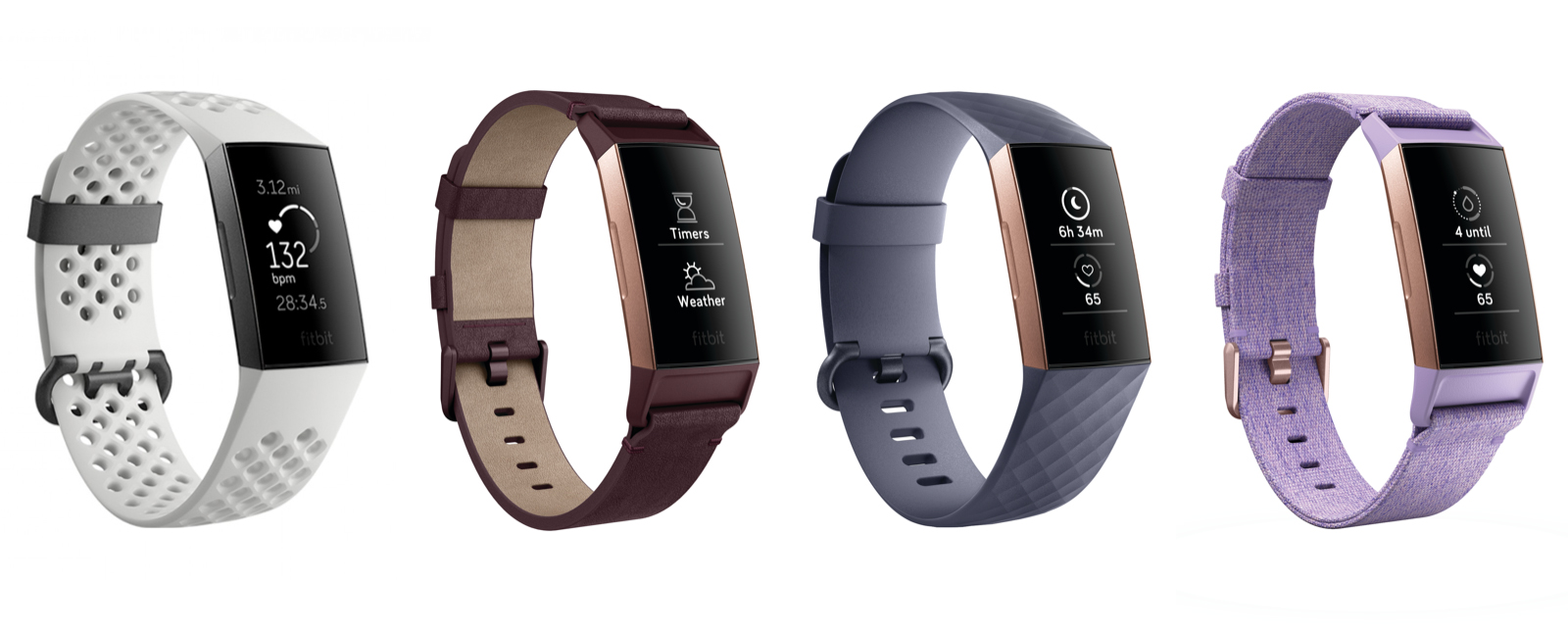
Fitbit Charge 3 is available in the normal version in Aluminum Graphite Gray / Black and Aluminum Rose Gold / Blue or in the S version pecial edition (identical in functions but with Fitbit Pay) in the colors Lavender fabric / Rose gold aluminum and Graphite gray aluminum / ice white (the Special Edition version also includes a second black bracelet).
Fitbit products are distributed in Italy by Techdata, Athena and Attiva, but can also be found online in both normal and Special edition versions.
,,


