Introduction
Creating an organization chart can be a daunting task, but with the right tools and guidance, it can be done efficiently and effectively. One popular tool for creating org charts is using PowerPoint. In this blog post, we will discuss the explanation of hierarchical charts in PowerPoint and how to create them using the available tools and features.
Explanation of hierarchical charts in PowerPoint
PowerPoint offers several designs, layouts, and options for creating organizational charts. The most common type of an organizational chart is a hierarchical chart which is also known as a tree chart. This particular chart can be used to show the relationships between different departments, positions, or individuals in an organization. It can also be used to demonstrate the chain of command or the reporting structure in a company.
In PowerPoint, you can create a hierarchical chart by accessing the “SmartArt” feature on the “Insert” tab of the ribbon. This will open a gallery of options, including a “Hierarchy” category that has several chart layouts, including “Organization Chart”. You can choose from a variety of layouts to create a chart that best represents your organization’s structure.
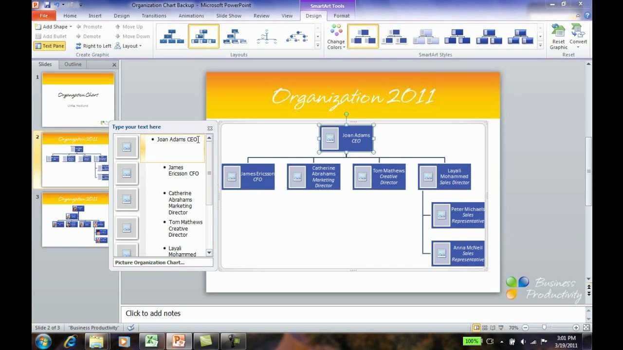
Once you have chosen a suitable layout, a new chart will open with pre-designed shapes and a text pane displayed on the left side of the screen. The text pane will provide you with an outline format to fill in the chart. For instance, when you type in the top bullet point in the text pane, you also fill in the top shape of the chart. Each level in the outline fills in the next level of the chart. Similarly, when you add a new row, PowerPoint will create a new shape in the chart automatically.
To add or edit text in your chart, you can click on a particular shape to select it, and then type your text directly into the box. You can also copy and paste text from an external source into the chart’s text pane. Here the use of tables, bullet points, and bold text comes in handy while adding and editing the text.
Conclusion
Therefore, creating hierarchical charts in PowerPoint is not a complex process. With a few clicks and the use of the SmartArt feature, you can create a visually appealing and informative org chart that accurately represents your organization’s structure. Keep in mind, while creating org charts, use tables, bullet points, and bold text effectively to ensure clarity and readability. By keeping the chart simple and easy to understand, you can help your audience grasp the relationships and hierarchies in your organization.
Getting Started
Steps to create an hierarchical chart on PowerPoint
First, to create an organization chart on PowerPoint, the user needs to click on the “INSERT” tab. Under the “Illustrations” group, the user should click on the “SmartArt” button. In the “Choose a SmartArt Graphic” gallery, select the “Hierarchy” option. Then choose an organization chart layout, such as “Organization Chart,” and click “OK.”
After the chart is displayed on the slide, the user can enter text by selecting any box of the SmartArt graphic and type the text. If the user doesn’t want to type directly into the SmartArt graphic, he/she can also type the text into a text box and then copy and paste the text into the SmartArt box. It is recommended to type the text first outside of the SmartArt graphic to avoid any formatting issues.
Locating the SmartArt button on PowerPoint
To locate the “SmartArt” button on PowerPoint, the user should first open PowerPoint and select the desired slide. Then he/she should navigate to the “INSERT” tab on the ribbon, which is located near the top of the screen. Next, look for the “Illustrations” group, which contains various buttons to add images, shapes, and charts to a slide. Finally, click on the “SmartArt” button to open the gallery of available SmartArt graphics to use.
It is important to note that there are several types of SmartArt graphics to choose from, each designed for different purposes. For example, if the user wants to create a timeline, he/she should look for the “Process” or “Cycle” options in the SmartArt gallery.
Therefore, creating a hierarchical chart on PowerPoint is a straightforward process. By following the steps above, users can easily create an organization chart, timeline, process flow, or any other type of SmartArt graphics. Although it may take some time to get used to the SmartArt tools, it’s worth investing time in learning how to use them efficiently to enhance any presentation.
Choose an Hierarchy Option
When creating an organizational chart on PowerPoint, the first step is to select the appropriate hierarchy option. In the “Choose a SmartArt Graphic” gallery, the user should click on the “Hierarchy” option. This category contains several org chart layouts on which the user can base the chart.
Types of hierarchy options in PowerPoint
The “Hierarchy” option in PowerPoint provides users with a variety of chart layouts to choose from. These layouts are designed to fit various organizational structures and present different types of information. Some of the types of hierarchy options in PowerPoint include:
– Basic hierarchy: This is the most common type of hierarchy chart, presenting a simple view of an organization’s structure. It can include several levels of management, with the topmost level usually being the CEO or president.
– Picture hierarchy: This type of chart layout includes images of each employee or team member in the organization. It provides better visualization and allows users to connect faces to specific job titles.
– Mixed hierarchy: This chart layout combines different types of shapes, such as rectangles and circles, to represent different types of positions within an organization. The user can customize each shape and alter its color and size.
– Labeled hierarchy: This option includes additional labels on the chart layout, such as team names, department names, or specific projects or initiatives.
Examples of organizational chart layout
In the “Hierarchy” option, PowerPoint provides several examples of organizational chart layouts to choose from. These layouts include:
– Organization chart: This is a basic layout that includes rectangular shapes representing each job position in the organization. Each shape is connected to another through a series of lines or arrows, indicating the reporting relationships within the company.
– Team hierarchy: This layout includes various shapes representing teams, with a higher-level shape indicating the team leader or manager. It can be used to show cross-functional teams or those collaborating on specific projects.
– Picture organization chart: This layout includes images of employees in each shape, making it easier for users to identify team members and connect faces to job titles.
It is essential to choose the appropriate organizational chart layout that best fits the organization’s structure and the desired goal of the presentation. Once the user selects the hierarchy option and chart layout, he/she can begin to input the relevant data into the chart. It is recommended to plan out the chart’s structure ahead of time to ensure that all necessary information is included and the chart reflects an accurate representation of the organization.
Add an Org Chart to Your Slide
Creating an organizational chart on PowerPoint is vital for communicating important information to diverse audiences effectively. Incorporating an organized and structured chart in a presentation gives viewers a clear picture of hierarchical relationships, job titles, and responsibilities within a team or organization. Users can easily add an org chart to their slide by following these steps:
Steps to add the selected org chart on a slide
The initial step to add an org chart to your slide is to click on the “INSERT” tab on the ribbon and select the desired slide. Next, navigate to the “Illustrations” group and click on the “SmartArt” button. Then select the “Hierarchy” option in the “Choose a SmartArt Graphic” gallery and choose an organization chart layout, such as “Organization Chart.”
Once the chart is displayed on the slide, select any box of the SmartArt graphic and type in the desired text. Alternatively, type the text outside of the SmartArt graphic and copy and paste it into the box. Ensure consistent formatting by using the same font size and style throughout to create a visually appealing chart.
Choosing the slide design for the chart
After selecting an org chart and adding relevant information, the user can adjust the slide design to enhance its visual appeal. Clicking on the “DESIGN” tab on the ribbon shows various predefined templates and color schemes to choose from. Users may also customize the design by altering the background color, font, and text color or adding an image as the slide background.
It is worth noting that there are various other types of SmartArt graphics available to users. The user may choose a timeline, process flow, cycle, hierarchy, or matrix, depending on the presentation’s content. When using any SmartArt graphic, ensure that it is relevant to the presentation’s context and creates clarity regarding the information presented.
Therefore, adding an org chart to a slide on PowerPoint is a simple and effective way of displaying hierarchical relationships within a team or organization. Users can choose from several predefined templates or customize the design to make their presentation more visually appealing. Adopting a consistent design and using proper formatting techniques can create an organized and professional-looking chart that effectively conveys the information presented.
Using the Text
Once an org chart has been added to a slide, the next step is to edit the text boxes. There are two options to do so. Firstly, click on a box within the chart and type the text directly into it. Secondly, click “[Text]” in the Text pane and then type the desired text outside the chart. Afterward, copy and paste the text into the appropriate box. This strategy is useful when users want to create the entire chart first, then add information later.
Editing and Formatting Text Boxes in the Chart
Individual text boxes within the chart can be formatted by clicking on the box and adjusting the font style, size, and color according to the user’s preferences. To change the font, size, or color of the text in the entire chart, click on the “Design” tab of the ribbon and choose from the preset color schemes and themes available. Users can also customize the color, text, and font on text boxes that make up the chart.
Text boxes can also be moved by clicking and dragging them to the desired location on the chart. If the text does not fit in the box, click on the box, go to the “Text” tab on the ribbon, and click “Shrink text on overflow.” This move will reduce the font size to fit into box sizes that users have marked.
Customizing the Content of the Chart
After entering text into the chart, users can customize the chart’s content further. For example, they can add new text boxes by clicking on an existing box and then clicking the “Add Shape” button. They can also delete boxes by clicking on a box and then pressing the “Delete” key on the keyboard.
Users can also change the layout of the chart to suit their preferences. To do so, select the chart object and click on the “Design” tab on the ribbon. From the options provided, choose the desired layout by clicking on the preferred layout icon. This move will auto-arrange the boxes in the chart in that layout to enhance coherence and readability.
Therefore, PowerPoint’s org chart feature is a useful tool for presenting information in a clear and concise manner. With various customization options for text, format, and content, users can tailor their charts to the presentation’s context and requirements, enhancing visual appeal and effectiveness.
.
Add More Elements to Your Chart
Once an org chart has been added to a PowerPoint slide, there are several ways to enhance it by adding more elements. PowerPoint’s SmartArt tool offers different shapes and images to expand the chart’s visual appeal, and elements can also be connected to create a more comprehensive hierarchy.
Adding shapes and images to the chart
Users can add shapes to their org charts by selecting the SmartArt graphic and navigating to the “DESIGN” tab on the ribbon. Once there, users can choose to add more shapes to a chart by clicking on the “Add Shape” button. These extra shapes can be added either horizontally or vertically. Users may also add images to the chart by selecting the desired shape and clicking the “Insert Picture” button. Selecting a picture from the user’s computer adds it to the shape, enhancing the chart’s visual appeal.
Connecting elements in the chart
To enhance the chart’s functionality and improve the viewer’s understanding of the relationships within the chart, users can connect shapes in the chart. By selecting a shape, the user can click the “Connect Shapes” button on the SmartArt ribbon and use the mouse to drag a line to the target shape. This effectively creates a connection between the two shapes. Users can also add subordinates to their chart by selecting a shape, either a manager or employee, and clicking the “Add Assistant” button. This function adds a subordinate shape that is connected to the primary shape with a dotted line, clearly indicating the hierarchical relationship.
It is crucial to keep in mind that adding more elements to an org chart should serve to enhance its visual appeal and improve its functionality. The chart’s overall design should remain simple and uncluttered to prevent making it confusing for viewers. Adding elements beyond what is required may end up detracting from the chart’s effectiveness.
Therefore, PowerPoint’s SmartArt tool offers versatility to create an org chart that is informative and visually appealing. By adding shapes and images, elements can be connected to indicate hierarchical relationships more comprehensively. However, it is essential to remember that the overall design should remain uncluttered. When done correctly, an org chart becomes an effective tool for communicating hierarchical relationships within a team or organization.
Change the Color and Style of Your Chart
Once an org chart has been created in PowerPoint, users can customize its look by changing its color and style to enhance its overall visual appeal. Changes can be made quickly and easily using PowerPoint’s SmartArt tools, which offer a broad range of color schemes and design layouts.
Altering the colors and styles of the chart
To change the color and style of a chart in PowerPoint, users must first right-click on the existing org chart and select “Style Color” or “Layout.” From there, they can choose from several different design options, including color schemes and layout styles that can be applied to the chart. Users can preview the different color and style options before making a final selection to ensure the chart appears the way they want it to. Finally, clicking the “OK” button applies the chosen design to the org chart.
Creating a color-coded chart
One popular option for visually enhancing an org chart is to create a color-coded chart. This method of customization can be particularly useful for organizations with a large hierarchy or complicated reporting structure. By assigning different colors to different levels in the chart, viewers can easily identify which individuals hold the same position.
To create a color-coded org chart, users first need to create the chart by selecting the SmartArt tool and choosing an appropriate chart type. Then, they can right-click on the chart and select “Format Object” from the dropdown menu. In the Format Object window, they can select the “Fill” option and choose a color that best represents each level in the chart’s hierarchy. These colors can be chosen from a preset palette of options or any custom color from the user’s computer. Finally, clicking the “OK” button applies the chosen colors to the chart, creating a color-coded org chart.
Overall, changing the color and style of an org chart is a simple but effective way to enhance its overall visual appeal. PowerPoint’s SmartArt tools offer a wide range of design options that can be applied to a chart quickly and easily. Creating a color-coded chart adds an extra layer of functionality to the chart and can make it easier to understand for viewers. By utilizing these tools, users can create an org chart that is both visually stunning and informative.
Save and Share Your Chart
Once an org chart has been created and enhanced with additional elements, it is vital to save and share it with others. Saving the chart in relevant file formats ensures its usability across different platforms and devices. Sharing the chart electronically via email or cloud-based file-sharing platforms allows others to view and use the chart for their purposes.
Saving the chart for future use
To save the chart in PowerPoint, users can select the org chart and navigate to the “File” tab on the ribbon. Choosing the “Save As” option allows users to save the file in different formats, such as PowerPoint Presentation or PowerPoint Template. The user can also rename the file for easy identification later. Microsoft PowerPoint also allows users to save the file to OneDrive, SharePoint, or other cloud-based file-sharing platforms.
Exporting the chart in different file formats
To export the chart in different file formats, users can navigate to the “File” tab and select “Export.” Choosing “Change File Type” allows the user to save the chart in file formats such as PDF, JPEG, PNG, or SVG. These file types are often useful when the chart is required as a static image or for platforms that do not support native PowerPoint files.
When sharing the chart, users can send it via email as an attachment or upload it to a cloud-based file-sharing platform to allow others to view and use it. Microsoft PowerPoint also has the option to “Embed” the chart in an email or other documents, allowing others to view the chart without having to download the file.
Therefore, once an org chart has been created, it is essential to save and share it with others. Saving the chart in relevant file formats and sharing it electronically allows others to view and use it for their purposes. By utilizing the appropriate tools in Microsoft PowerPoint, users can save and share their org charts to ensure effective communication of hierarchical relationships within a team or organization.
Save and Share Your Chart
After creating an organizational chart and enhancing it with additional elements, the next vital step is to save and share it with others. To ensure usability across different platforms and devices, it is crucial to save the chart in relevant file formats and share it electronically via email or cloud-based file-sharing platforms.
Saving the chart for future use
To save the chart in PowerPoint, users can select the org chart and navigate to the “File” tab on the ribbon. By choosing the “Save As” option, users can save the file in different formats, such as PowerPoint Presentation or PowerPoint Template and also rename the file for easy identification later. Additionally, Microsoft PowerPoint allows users to save the file to OneDrive, SharePoint, or other cloud-based file-sharing platforms.
Exporting the chart in different file formats
Exporting the chart in various file formats is possible by navigating to the “File” tab and selecting “Export.” Choosing “Change File Type” allows users to save the chart in file types such as PDF, JPEG, PNG, or SVG. These file types come in handy if the chart is required as a static image or for platforms that do not support native PowerPoint files.
When sharing the chart, users can send it via email as an attachment or upload it to a cloud-based file-sharing platform to allow others to view and use it. Microsoft PowerPoint also has the option to “Embed” the chart in an email or other documents, enabling others to view the chart without downloading the file.
Summary of the steps involved in creating an organizational chart in PowerPoint
Creating an organizational chart in PowerPoint is possible even for beginners with a suitable step-by-step guide. The following are the steps involved in creating an organizational chart:
– Step 1: Insert SmartArt Graphic – In MS PowerPoint, select a new document, click on the insert tab in the ribbon menu, and choose the SmartArt option.
– Step 2: Customize the Chart – Customize the org chart by entering the names and titles of the individuals, departments, or teams.
– Step 3: Enhance the Chart – Enhance the chart with additional details such as pictures, design elements, and color schemes.
– Step 4: Save and Share the Chart – Save the chart in relevant file formats such as PowerPoint Presentation or PowerPoint Template and share it electronically via email or cloud-based file-sharing platforms.
Tips for creating professional-looking charts
When creating an organizational chart, there are several design tips to take into consideration, such as maintaining consistency in font sizes, styles, and alignment. Additionally, using appropriate colors and shapes can help the chart stand out and make it easier to understand. Lastly, adding pictures and other design elements can add value to the chart and make it look more professional.
Conclusion
Creating an organizational chart is an essential step in maintaining effective communication of hierarchical relationships within a team or organization. With the appropriate tools and a step-by-step guide, like the one described above, creating and enhancing a chart in PowerPoint is possible even for beginners. Taking the time to save and share the chart in relevant file formats ensures its usability across different platforms and devices, and sharing it electronically helps others view and use it for their purposes. With these steps and design tips, anyone can create a professional-looking organizational chart in PowerPoint.