Home MacProf DTP and Web Design ,,,,,
… [/banner]
QuarkXPress 2017 is the new version of the historic layout software: after the commercial and technical reboot a few years ago, the App is now a continuous growth and a hotbed of interesting ideas to the point that it almost seems to be in front of a freshly released App, instead of a name that dates back to the dawn and helped to create DTP.
Bella also the social activity that has brought many improvements coming directly from users, with a survey done by Quark, an operation that had already been done with the 2016 version (here our review) and which has also continued with the new edition.
QuarkXPress 2017 gets better by adding new features and improving existing ones, introducing a revolutionary App publishing system while offering free single iOS apps to all users.
The new version of QuarkXPress manifests itself as a piece of innovation and an alternative for the whole market: like several other software such as Affinity Photo and Affinity Designer, Luminar and DaVinci Resolve certify that the network is ready for the umpteenth revolution and that the dominant position of Adobe (which with the CC imposed users a subscription that has never really been digested) is now subject to an open and stimulating comparison.
In these pages we wanted to put QuarkXPress 2017 to the test to examine well the news, both by historical users what we are, both from the point of view of a new user who faces for the first time.
The news are many and interesting, some clearer than others, but the examination is more difficult than it seems: a little work still needs to be done but surprises are not lacking.
 The installer of QuarkXPress 2017 for Mac has been improved: it is now an App that you drag to the Applications folder, and everything else is installed by itself on first launch
QuarkXPress 2017, Transparencies and blends
At first glance, the 2017 version hasn't changed much from the previous ones, at least in appearance: palette and menus have remained the same, even if there is any lifting operation: the modularity of the vanes has been increased (but it is still not possible to hook them horizontally, too bad) and some icons and some commands have been revised to improve the automation.
The possibility of controlling the increment of a value through sliders has been (finally) implemented and the latest fonts used are also present: improvements that are not exclusive but always useful in a modern App.
The Blend functions of images and objects have also been implemented, so that interesting effects can be easily obtained without having to fumble with linked images and use of Photoshop / Illustrator.
The idea is that Quark, over time, tends to lead to his inter no if not all at least the main functions of the other accessory software, such as Photoshop and Illustrator, freeing the user from the need to own them or, if nothing else, to have to open them and make a continuous switch.
For this reason, functions typically delegated to photo editing programs have been added, such as the use of filters in images: in fact, the palette contains 12 image filters that can be applied to an image connected in a non-connected way. destructive and progressive, as if it were Layer Effects in Photoshop.
If you need a precise retouching a professional editor is still suggested, but often the Gaussian Blur effect is l 'ideal for putting a background image.
Too bad that at the moment the effects are limited to the box itself, in the sense that if mixed with blending modes they do not work between different boxes but only with the background of the box itself.
The nu ova palette for multiple shades, a function that has always been requested by users (previously it was limited to two colors): the implementation was done very well and in a complete way, with multiple colors of your choice and also with transparency effects for single color . Complex gradient is also applicable to object edges, not just content.
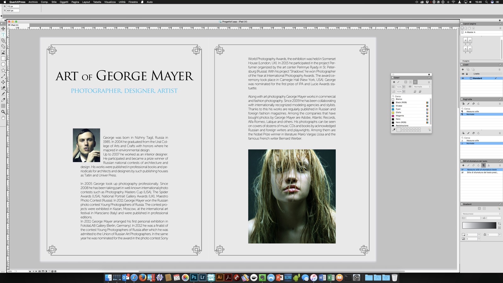 QuarkXPress 2017 interface has undergone some facelifts but it presents itself in the same austere way as the previous versions
… [/banner]
Easy transition
Many of the readers who follow us will wonder , beyond the features of QuarkXPress 2017, the actual difficulty in switching from an InDesign-based workflow to one on QuarkXPress.
You have to pay the price of 'habit of a work environment that inevitably changes, of course, but there is also compatibility with the past to consider: if you still need InDesign for the archive, you might as well use it.
For this reason, however, QuarkXPress has implemented a series of very effective conversion tools: QuarkXPress does not open InDesign documents, but allows the copy and paste from InDesign and QuarkXPress in a very intelligent way, leaving unaltered text boxes, outlines, links to images and dynamic elements.
In addition to this, with this version the Convert to native object function has been added: in practice, the App allows you to convert vector objects to orants (EPS, PDF, AI) in native QuarkXPress objects, useful for local editing. Do you have a PDF of an old job? You can import it and, by converting a part of it, update it and reprint it (or export it to another format, as we will see).
The function is magical and works perfectly with AI vector objects: we did some tests without finding any defects, and it is obvious that a complete test of this type would need months of testing, but even if there were limitations, remember that the function is not necessary in a correct workflow, but very useful for speed up otherwise boring and complex phases.
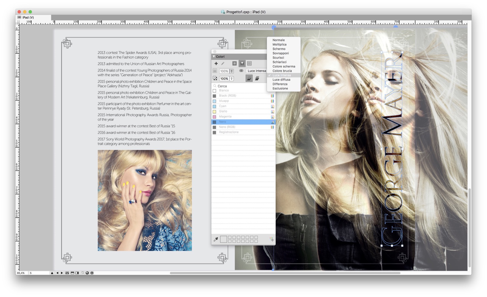 One of the most interesting new features, blending modes
Typographically speaking
The typographic part has always been a flagship for QuarkXPress, and this version makes no difference: it has been added the possibility, also in this case not exclusive, for the outline of the text, a function previously possible only by transforming a text window into a static window (an operation that QuarkXPress does in an excellent way).
However, the innovative function of managing text in columns is much more interesting: it is now possible to manage a single column or a text in multiple columns dynamically .
For example, now the text in a column can go out and abound in the next column (useful for texts that have a title that abounds and a text that fits in the columns) , so you can use a single shape for everything.
The possibility of managing the lines between columns has also been improved, which can now be rendered dynamically and without being bound to the text or to the box, but with ad hoc parameters.
Finally, the import of Word documents and the support of footnotes has been improved.
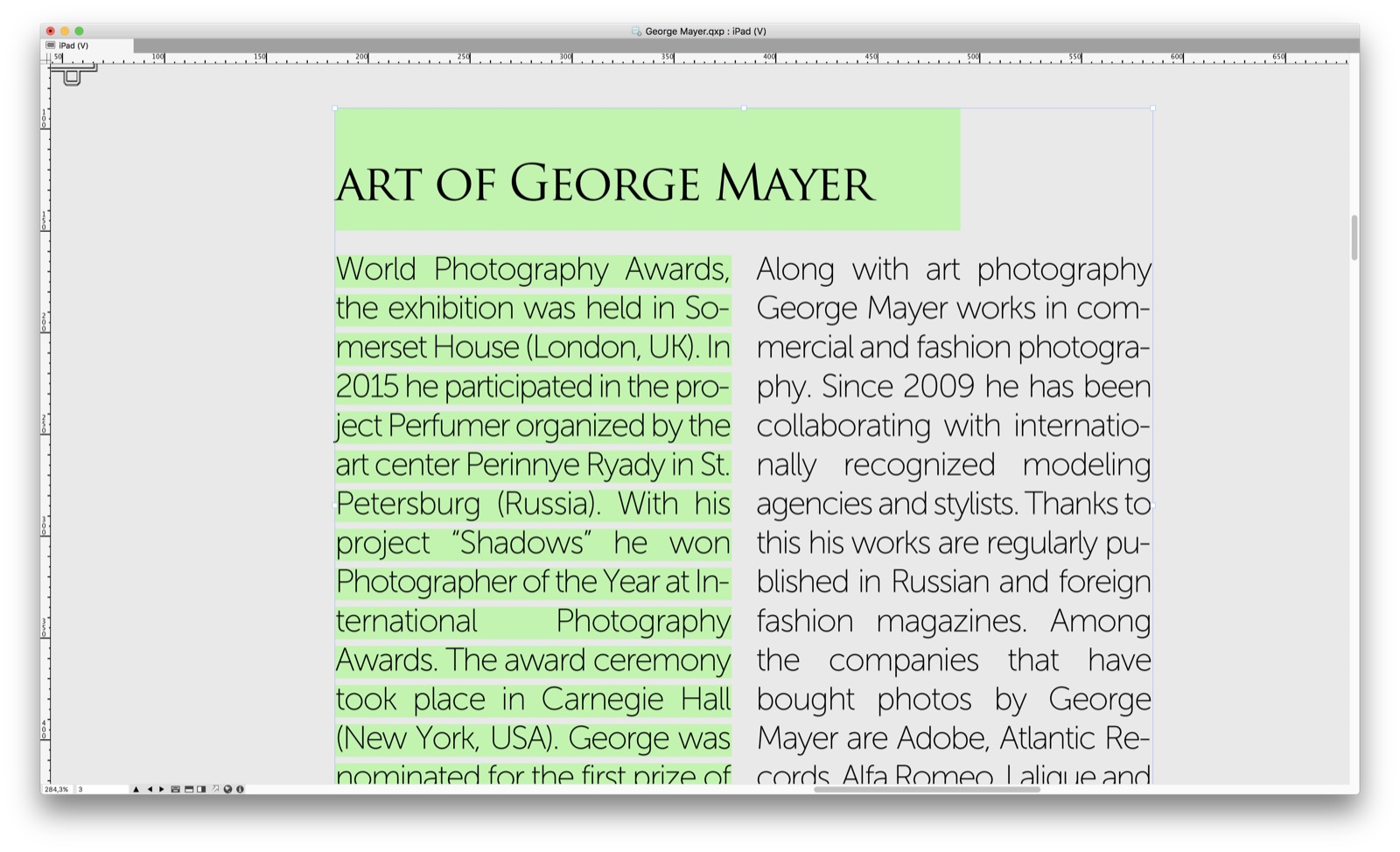 Typographical novelties: now it is possible to shell out a text in another column without acting on the boxes
… [/banner]
Digital Publishing, the future is now
The topic Digital Publishing is very hot and in this QuarkXPress 2017 probably plays a good part of the future.
The most important news is certainly commercial: with this version it is possible to create and publish unlimited singles App on the App Store for iOS thanks to the native use of the App Studio plug-in that Quark acquired long ago. This operation, which previously cost around 200 Euros per App, sheds new light on the cost of the upgrade or full license, because the generation of individual Apps can be an important incentive for a printing company that is looking for new opportunities.
However, this option must be detailed: first of all the publication cost is free for the license, but the preparation on the Apple Developer portal and the annual cost of a license from developer of 99 Euros.
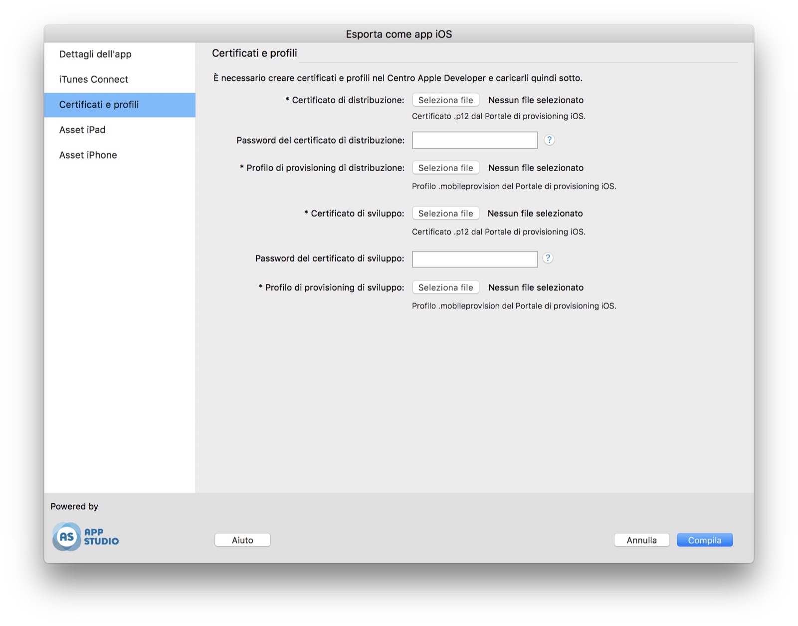 The export of a single App is done directly from the App, just do the upload the certificates and QuarkXPress 2017 will do the rest
Secondly, the publication is limited to iOS (iPhone and iPad), for the moment the Android platform is still paid as the costs for the kiosks remain alive (in case the single App has to evolve): even considering these poles, however, the option is very interesting, because at the moment there is no tro plug-in for Digital Publishing that allows the creation of a single App in a free way, as fast and easy as QuarkXPress 2017.
Furthermore, the second positive note in this sense is given by the almost completely automated publishing system (as far as Apple allows it): a single window allows you to upload certificates and generate the App on Quark's servers, a phase that cuts through the whole problem of generating an App on your Mac that anyone who has tried remembers with terror.
 An example of export to HTML5, now responsive
But since Digital Publishing it is not only App but also HTML5 now, QuarkXPress 2017 improves the publishing system in this sense by making it responsive (here an example). Unlike Adobe, however, in this sense Quark leaves the user free to host everything where he prefers and also activates offline viewing (not present in the 2016 version).
A fashion classic
QuarkXPress 2017 is basically an improved version of the 2016 edition, as the latter was of the 2015 edition: this is to say that the Quark's attention is high, despite Adobe's pressure in this without being important.
The news in this version are many and important, but we wouldn't want to be misunderstood: some flaws are again, as a recording system that is still too complex, a poor elasticity of the native format, a modularity of the interface to be revised and a speed that can be improved.
However, the efforts to remain active in the the market is there and you can see the results: from a competitive perspective QuarkXPress 2017 has its say and offers incredible precision and automation tools, some exclusive ibid, which we hope (together with the names mentioned at the beginning such as Affinity and DaVinci) that they mark a new era of competitiveness and more possibilities for users in choosing the tools to use on a daily basis.
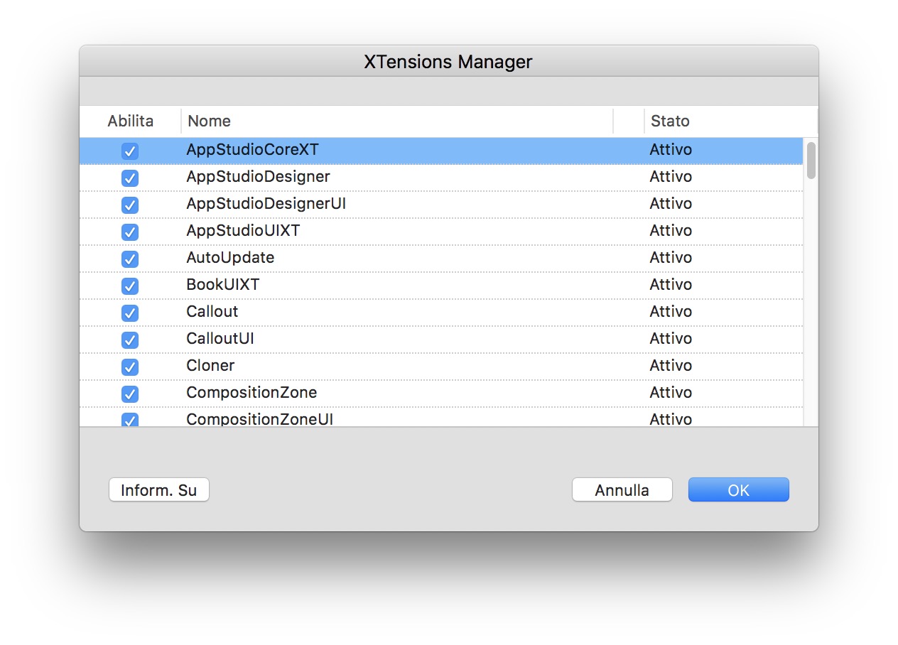 The new XTension manager
The road is long, but the feeling is that it is more commercial and technical towards the main competitor, because the cards on the table are there and the possibilities, beyond personal habits, as well: the purchase card, instead of the subscription, is not to be underestimated and we like to think of a open, competitive and stimulating market where the protagonists are many and users can choose as freely as possible.
QuarkXPress is available for purchase in both the full and update versions at prices very competitive (there is no subscription formula) starting from the official store or from the Italian distributor.
Users can try a version one complete product for 7 days by downloading it from this address.
[usrlist Design:4.0 Facilità-d’uso:4.0 Prestazioni:4.0 Qualità/Prezzo:5.0]
Pro :
Dozens of cool features for print and digital
Against:
Price : 829 Euro for the Full version, 399 Euros for the update from any version, 185 Euros for the update from the 2016 version
,,


