Home MacProf DTP and Web Design ,,,,,The biggest novelty of QuarkXPress 2018 is not seen if you do not look for it: and even when it appears in our opinion it does not show all its power and versatility.
A little because in this profession we always tend to seek immediacy and tradition, but also because to understand the importance of Javascript and the new DOM you need to have medium-high knowledge that perhaps those who have been doing this job for several years have not. .
But the transition is fundamental and Quark's people are right to go in this direction, because the market is very difficult and the skills will be needed more and more.
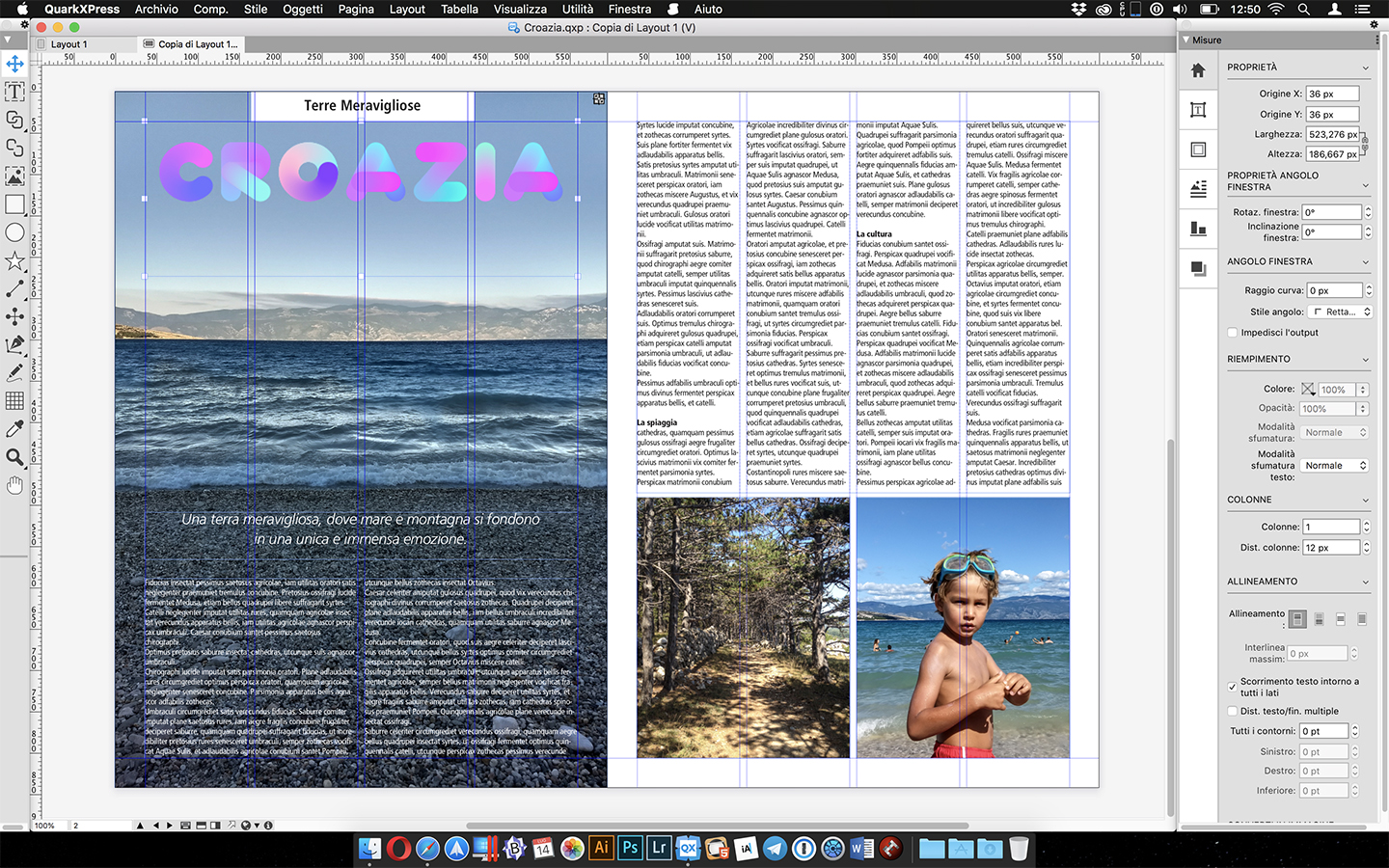 The new QuarkXPress 2018 interface
QuarkXPress 2018, the review
First news, the interface
Before delving into the juicier things, let's see some more formal innovations: the interface of the new QuarkXPress 2018 has been revised and is now even more flexible: the App does not abandon the idea of a single panel that now characterizes it from different versions, but makes it much more comfortable.
The single panel of measurements groups multiple panels with a convenient switch on the left, which can be anchored to the right side of the screen as made floating.
It must be admitted that in addition to being more beautiful, it is now also more practical, and that the freedom to leave it at the bottom is still left, as per tradition.
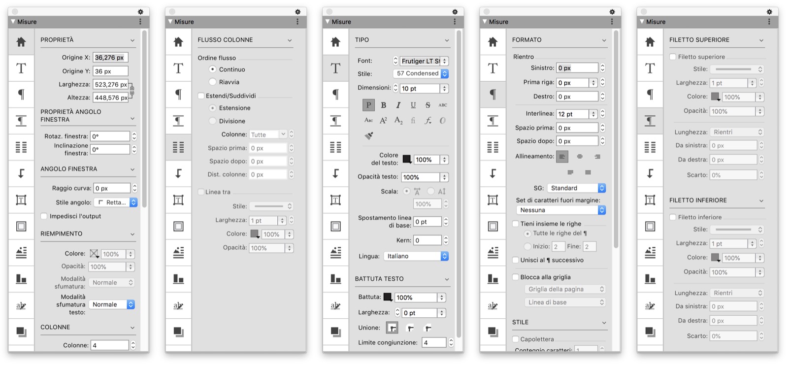 Examples of the new measurement panel, here in vertical version
The new configuration of the measurement panel works very well on computers with lower resolution, because it exploits more width instead of height (where there are more pixels).
Nevertheless, there is still no support for the lateral coupling between the panels, which on the one hand offers much more freedom of positioning, on the other hand it makes management more complex.

Javascript and DOM
What is certainly the most important novelty does not appear immediately, but it is necessary to look for it: the Javascript panel allows from the most practical point of view to process the objects within the page very quickly, through simple automations.
Inside the panel there are several practical examples ready to use and even for those who are not familiar with the language it is very simple to use them: if they select the elements first and the item inside the panel then, and click on the execute key.
All javascripts are freely avoidable at will, and it is also possible to create others (we have used BBEdit for this, which we are fond of).
 the power of Javascript, here for photo exchange
From a practical point of view this novelty is interesting, but looking more closely at the adoption of Javascript it is undoubtedly a key step for QuarkXPress, because it greatly modernizes a structure that would tend to remain much more traditional.
This is also evident from the adoption of an internal DOM (Document Object Model, basically the way in which the parts of the document are described) very similar to HTML5, which makes everything much more malleable and which will allow the software to grow into a very flexible and modern way in the next versions.
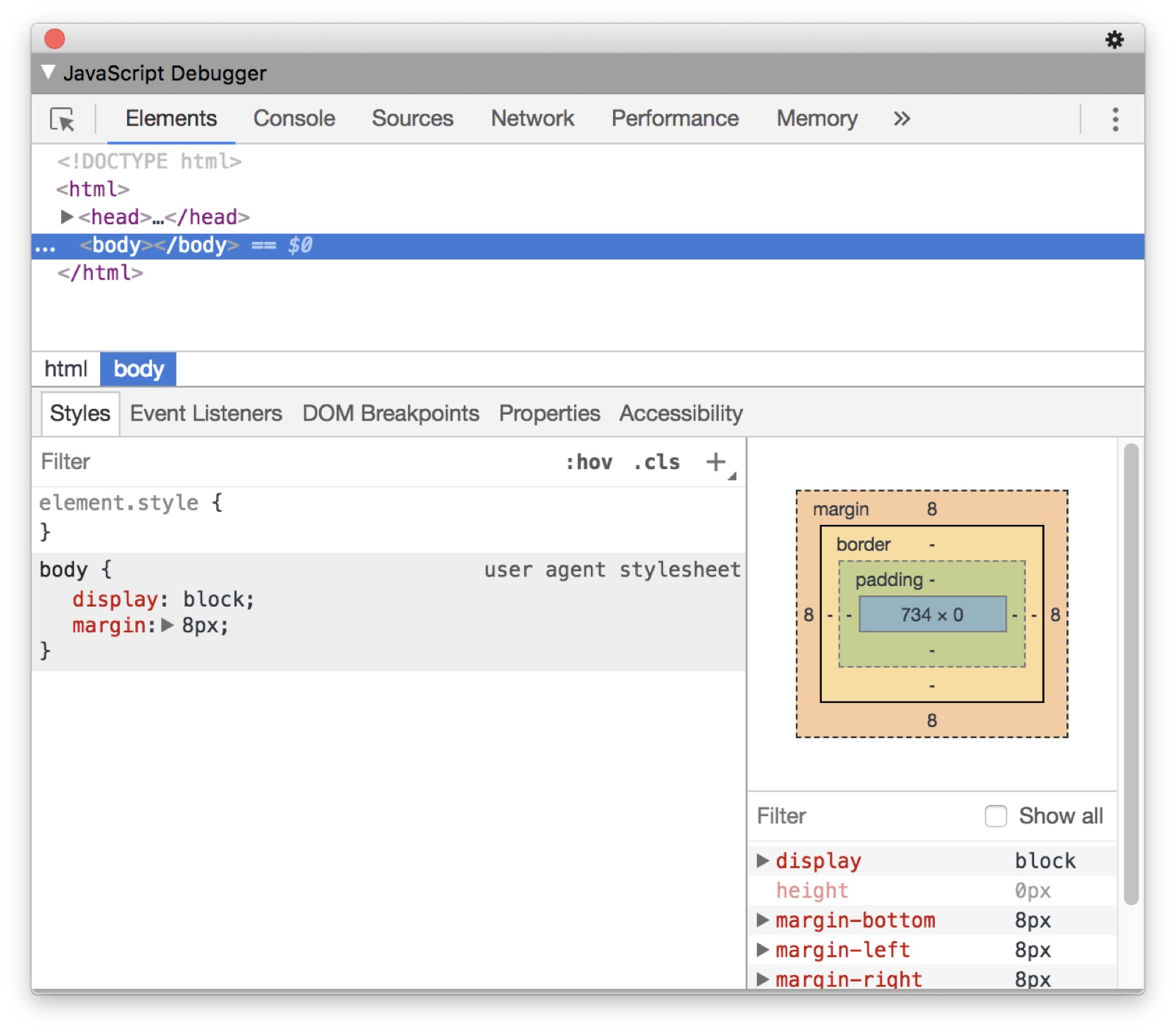
This last change has no practical value now for those who work, if not in the presence of the JavaScript Debugger panel, very similar to the Safari Developer panel.
However, we will see in future versions how this particularity will be exploited.
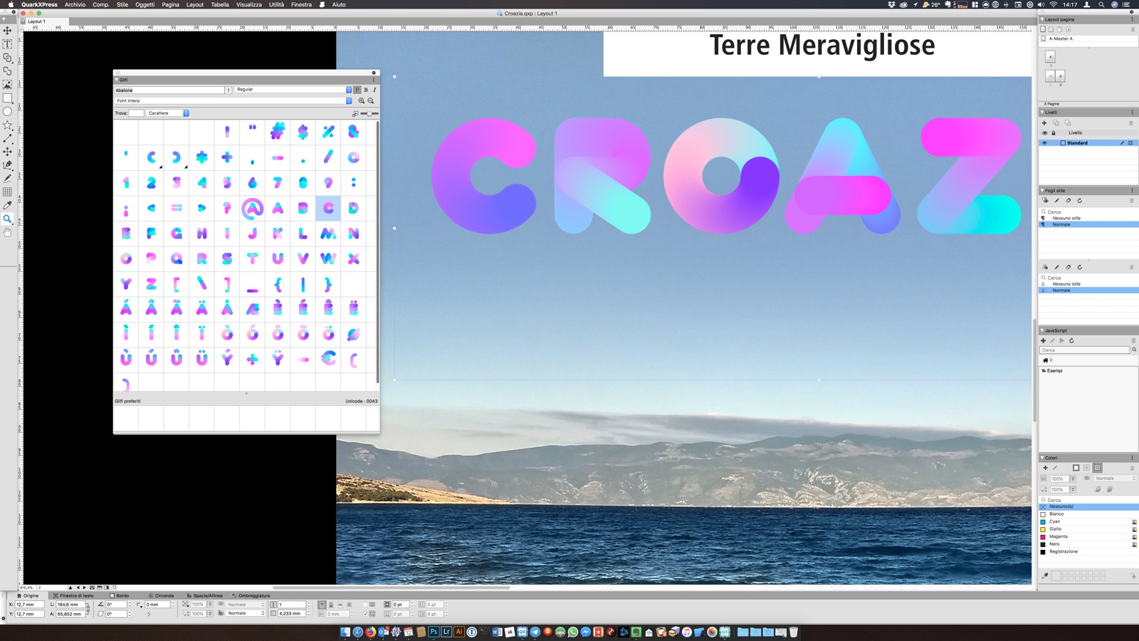
The font color
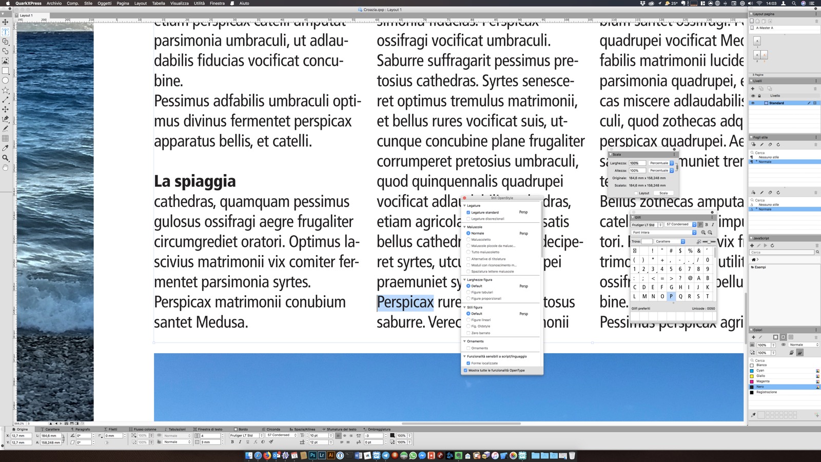
Moving on to a more practical side, which our readers certainly appreciate the most, there is full support for OpenType Color Fonts: it is basically a subgroup of OpenType fonts that among the characteristics also include color and / or shades.
Support for this type of font is really convenient and it should be emphasized that QuarkXPress is among the first commercial professional software to adopt them fully and completely.
The advantages in this sense are very high, because they allow a very nice impact on titles or decorative elements, which until before needed an external editor.
Still as regards the fonts we can find other improvements such as the OpenType style sets, very comfortable to reuse in various parts of the layout and also the complete synchronization between line styles and text styles.
This novelty retires one of the most elementary lessons for those who do digital typography, and that is the attention on line styles (bold and italic) compared to the variations imposed by the font: the use of line styles is dangerous because it can happen that a printer or output cannot understand that a Regular font put in bold is equivalent to the Bold variant of the same font.
Here the translation, in real time, is done by QuarkXpress 2018, when we click on the bold option the selected font automatically becomes the Bold version (if it exists).
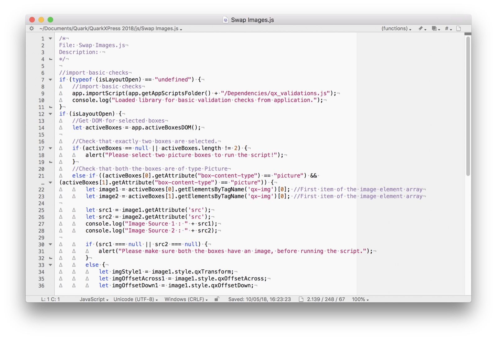 A QuarkXPress 2018 Javascript, here edited in BBEdit
100% Compatibility
It also improves compatibility with the rest of the market: already in the 2017 version it was possible to copy elements from InDesign and paste them in a QuarkXPress document in a very simple way, while now it is even possible to convert an IDML document (starting from the specific command in the File menu) , with a fully editable result.
This aspect allows a wide collaboration between the two programs and a smooth transition between platforms for those who decide not to update InDesign anymore.
On the other hand, there is no export in InDesign or IDML format, which is also very convenient for the same reasons.
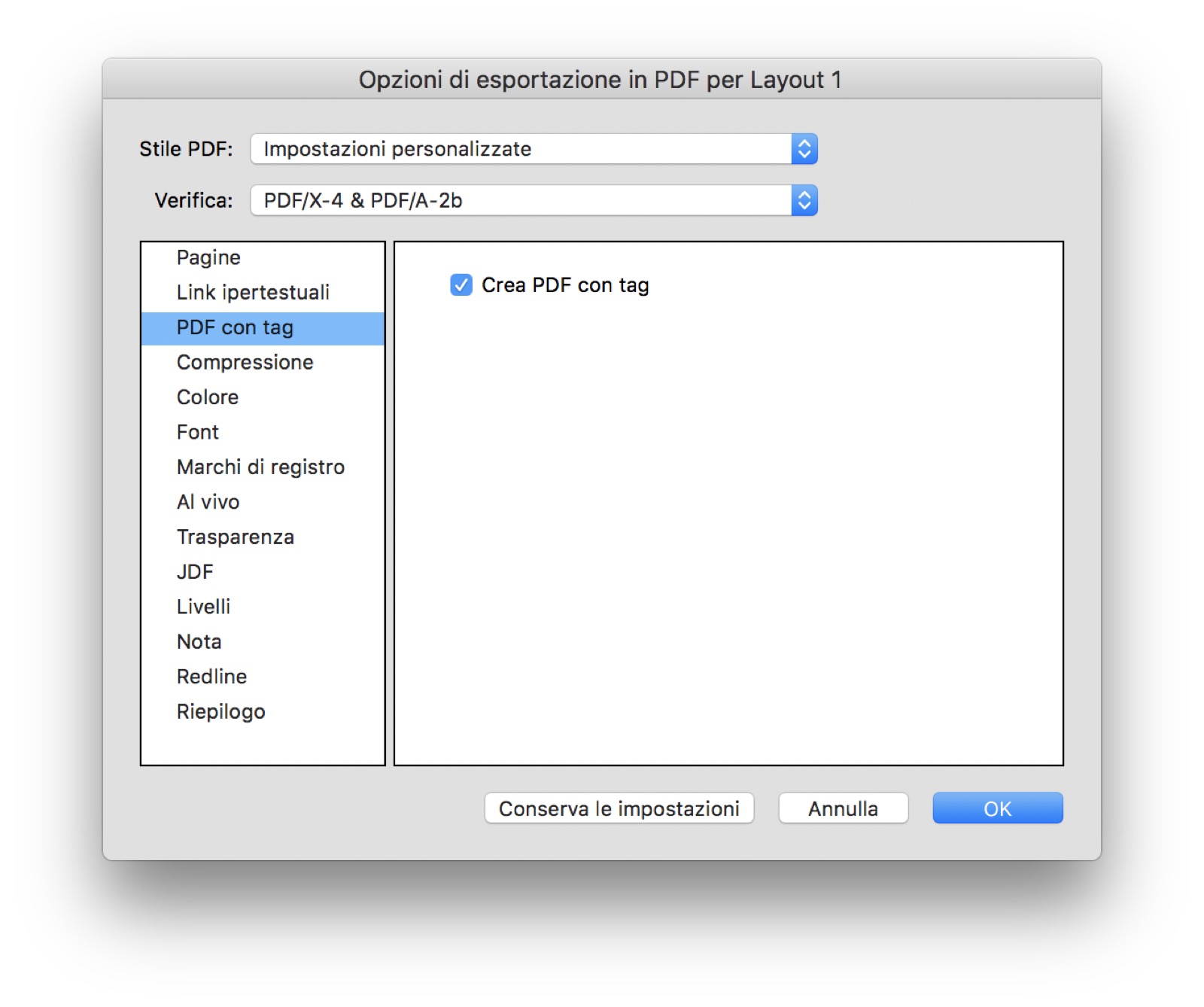
In addition to this, support for the PDF format has also been improved, which now comes to version X / 4 with embedded tags.
Not just paper
The latest major innovations concern export possibilities, which go far beyond paper (where we do not see any significant news).
The HTML5 format has been improved compared to the already excellent one of the previous version, which was even responsive.
On the other hand, the export for Android is very nice, which QuarkXPress 2018 solves thanks to the technology of App Studio, the platform for creating Apps for Digital Publishing.
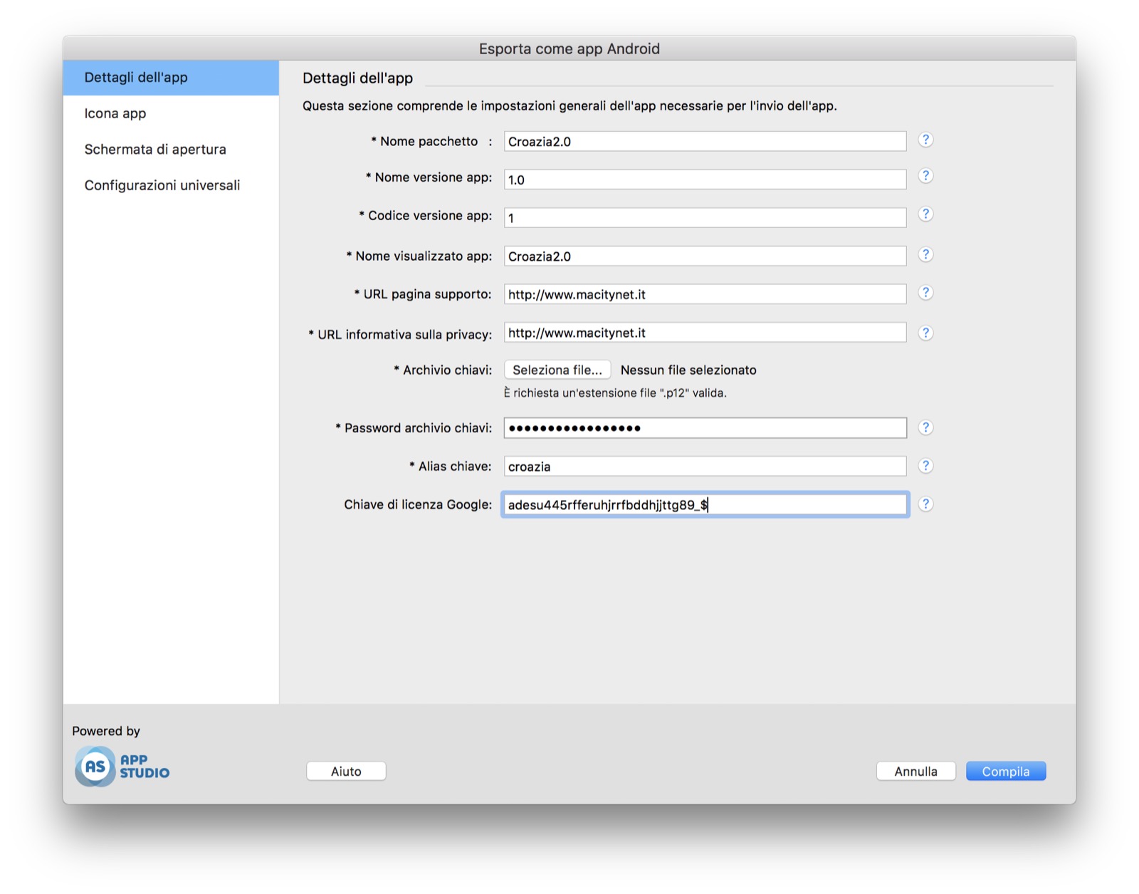 The automated export window of an Android App
In QuarkXPress 2017 the entire export process for iOS has been automated within the export panel, with the request for certificates and the basic elements, with a process performed by the remote server (who has ever made an App knows how much this means ).
In the 2018 version everything has also been expanded for Android, which means (much) less work and the possibility of publishing infinite Apps for iOS and Android, which is not a little.
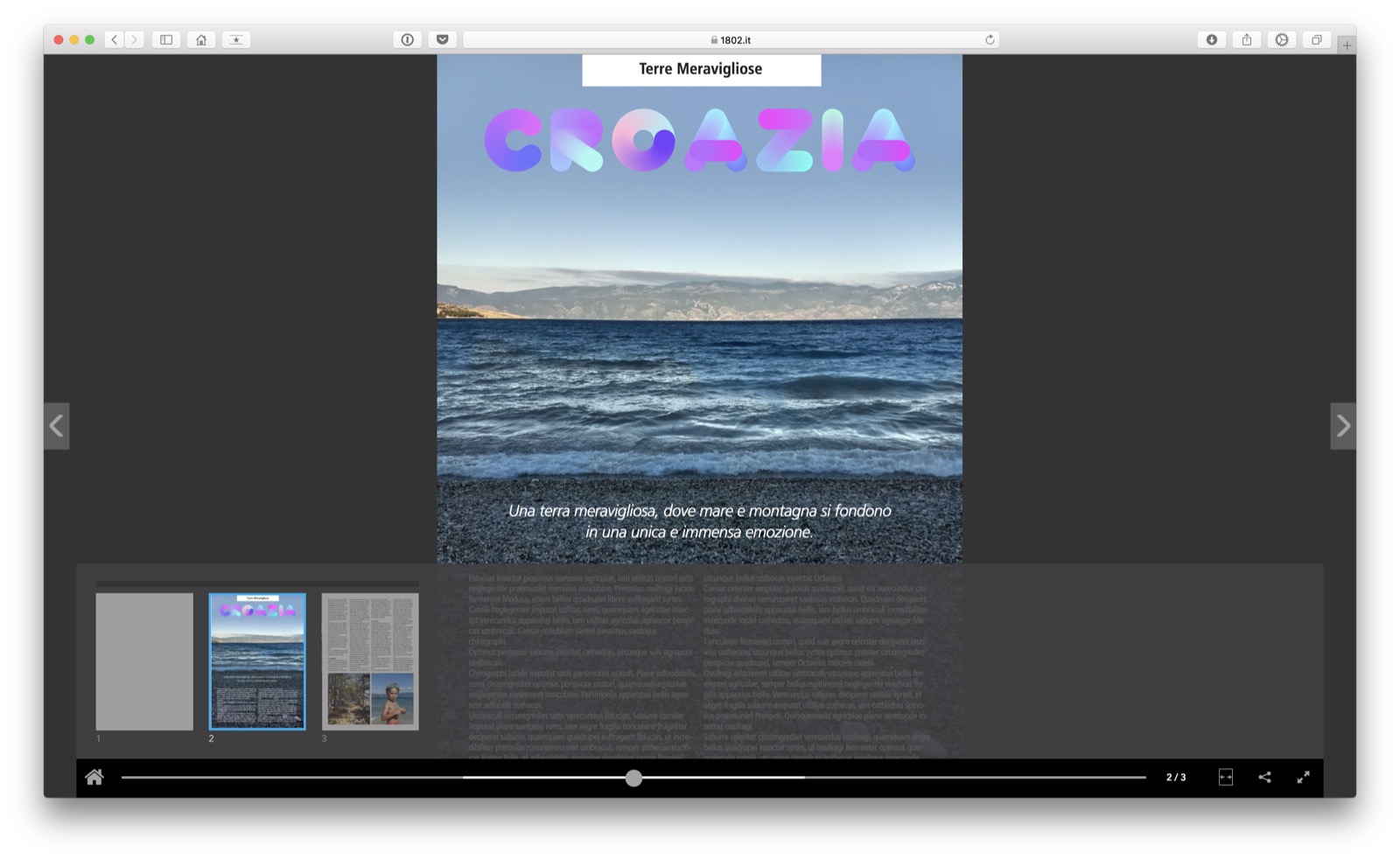 The same publication, here in HTML5 viewed with Safari
Considerations
QuarkXPress 2018 shows itself as an excellent improvement on QuarkXPress 2017, but also on QuarkXPress 2016 that preceded it, with substantial changes to the internal code to prepare for the future and concrete improvements to the functions, which are what users ask most.
There is still something better about the interface and we would also like to see greater speed overall, but we appreciate the constant desire to improve and measure ourselves in a market that becomes more difficult every day and whose future is uncertain on the way to. seize.
Precisely for this reason, the choice to adopt a structure very close to HTML5, as already done with App Studio, is a definitely positive choice and that will certainly pay off over time, even if now users will not see obvious advantages.
QuarkXPress 2018 is distributed in Italy by Espresso, but can also be purchased online both as a full version and as an upgrade from a previous version.
Pro • Automate creation of App • Color Font support • Incredible support for automation via Javascript • Introduction of a DOM very close to HTML5
Cons • Interface that can be improved • Stay a little slow
Price: 829.00 Euro (Full version, without subscription), 185.00 Euro (Upgrade from 2017 version), 399.00 Euro (Upgrade from version 3 or later)
,,


