Home Reviews ,,,,, Introduction to Scrivener: what we are talking about
The story of Scrivener is now known by many: its creator, the British Keith Blount, aspired to create the next great novel. But he couldn't find the right software. So, the story tells, he put his mind to the test by revealing unsuspected and unsuspected skills as a programmer, and created Scrivener. He explained it himself in an interview: «The first and main obstacle to the birth of Scrivener was the fact that I was not a programmer! I was so excited about making this program though, that I learned how to program myself. I bought a couple of great books on Mac programming (Stephen Kochan's Objective-C Programming and Aaron Hillegass's Cocoa Programming for Mac OS X), and spent four or five months studying. At the same time, in those same months I planned how Scrivener was supposed to work. I spent all of 2004 developing the application and released a beta version for National Novel Writing Month (nanowrimo.org) participants in November 2005. That was a truly great learning experience – it was full of mistakes! I scrapped it and started over with a complete software redesign. Scrivener 1.0 was officially released in January 2007, so it has taken me about two and a half years since I started it, even though the idea had begun to emerge a few years earlier. “
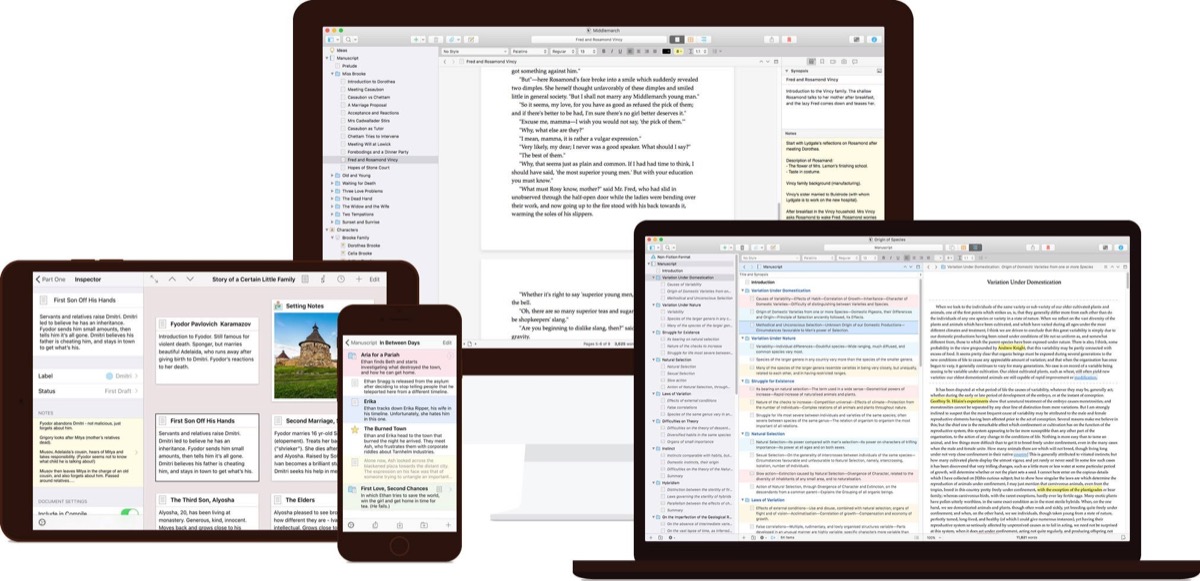
What is Scrivener? It is a word processing program, that is, a program aimed at those who work on prose and poetry texts, both non-fiction and non-fiction, but also scripts for cinema, television, radio and theater. It is not a text editor meant for programmers who want to write code. Its main feature is to be able to manage a set of texts as a single project. Within this project, the three most important functions of Scrivener are: 1) the ability to divide a long manuscript into smaller sections and to view each block in isolation or together with the other sections, ie as part of the whole; 2) the ability to assign each of these sections a synopsis, which can be viewed separately on a bulletin board or in an outliner, so you can rearrange the sections while looking only at their synopsis; 3) the ability to divide the editor into two panes (vertically or horizontally) and to view the writing in one pane and search in the other pane, regardless of whether that search is another chapter, notes, a PDF file , an image, a web page, or even the document itself.
Of course, Scrivener is also much more and much better, but these three are the key features, as its author, who was a primary school teacher for a London school and carried on Scrivener a few years as a hobby. But when he realized that he was earning more from the sales of Scrivener than from his profession, he resigned and founded a company, Literature and Latte (it must have been the name of a coffee shop that also sold books, the project Blount had from little boy). Now the company is a small company with about ten collaborators and is involved full-time in the creation, improvement, management, sale and assistance for the macOS, iOS and Windows versions of Scrivener (there is also a beta version for Linux, no longer developed
Here on Cyber Layman we are very attentive to what happens in the world of text manipulation: both from the point of view of editors and word processors, and then both for Mac and on iOS. We have talked about Scrivener several times, starting from this first review to this one a few years later to these that testify how much the iOS version was awaited, and how much the new 64-bit version for macOS, released a few weeks ago, was also expected. now also available on the Mac App Store.
Here is Scrivener 3 64-bit
Literatura and Latte knew it needed to update its word processing software to fully embrace the new 64-bit architecture and Swift as a programming language. It was the most rational move, after the long and exhausting wait for a version for iOS that remains unchanged at this moment, because it already had all the technological features within itself to be compatible with the documents generated by the then still non-existent version for macOS.
In practice, after a couple of false starts due also to unfortunate choices among the collaborators in charge of relieving him from the programming work, Blount has decided to reorganize both the iOS and macOS versions (the version 3 of Scrivener) so that they were aligned. A project that took a couple of years of work but which is now perfectly completed. The revolution was a work of rewriting the Scrivener engine, cleaning up the macOS interface, rationalizing the functions and creating a new way of use suitable for iOS-based devices (both iPads and iPhones of various sizes) that it is not apparently revolutionary, but which however meant working in depth and getting to create something completely new.

The new app was first presented in the version for sale directly on the Literature and Latte store and only after a few days in the Apple one. It is no secret that the Scrivener developer is happier to sell directly from their site, also because this allows for a faster release of updates (the approval procedure of the Mac App Store is still very long) than with more integrated features “in depth ”inside macOS that the operating system sandbox implemented by the store's policities does not allow. The delay has created some perplexity but no problem, apparently. Also because Literature and Latte fortunately has chosen to keep the app as a one-time purchase and not follow the subscription model that some of the competition has instead decided to practice.
The news according to the the first comments that it was possible to collect on the web were positively received, and the fact that “minor” updates were not necessary in the following days is a testament to the goodness of the realization of Literature and Latte and above all to the collaboration of the network, which had access to an extensive beta testing phase to which the good and collaborative writing community – a hard core of writers truly in love with Scrivener – went out of their way to try to find all possible bugs.
The novelties and possible uses of Scrivener 3
The main problem in reviewing Scrivener, despite being the software of choice since the first version for those who are writing this article, derives from the fact that it is so large and its possible uses are so many that it is difficult to frame a unique type of use to try.
Let's see some examples: the author of this article has used Scrivener over the years for various different projects. From non-fiction books to other people's book editing projects, from fiction to collections of articles (like the one you are reading) to website projects, screenplays, scientific research papers. Yes, because the fact that Scrivener allows you to collect heterogeneous material within the same project, combining text, pdf, images, web pages, allows you to transform it into the center of a new goal. And then, if it is a publication that must be made on different channels (ebook, paper book in hardcover and paperback edition), Scrivener also has everything you need to carry out the necessary exports (“conversions”, in software jargon). to ultimately manage the life cycle of a text from start to finish.
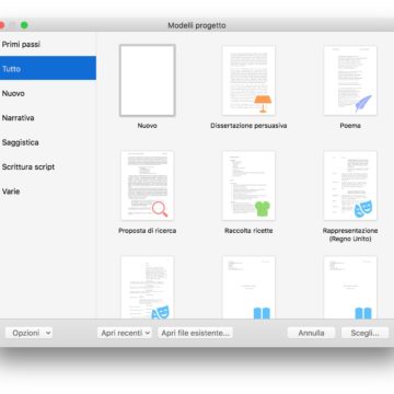
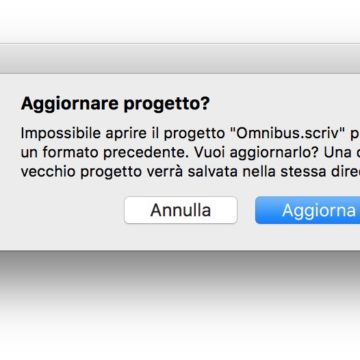
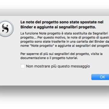
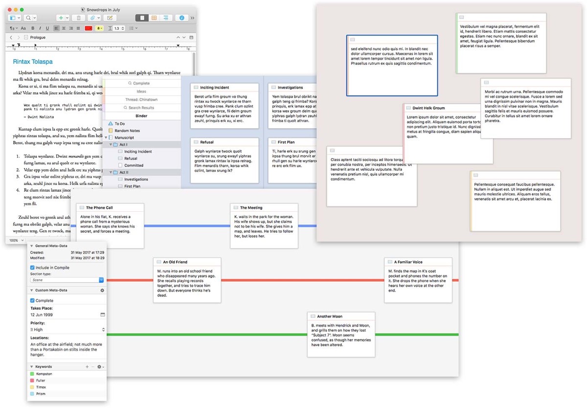
The novelties of version 3 are numerous: we start with a new graphics that are simpler and faster than that of the last ten years. The interface is newer and also brings with it some substantial improvements, starting with those in the just mentioned sector of “compilation” (creation of the manuscript to be exported) which is now more powerful but also easier to use. Furthermore, Scrivener 3 introduces a new system for viewing cards, new labels, better export with the addition of ePub 3 and Kindle formats, enhanced management of daily work statistics, better Custom Metadata, better outlining, better corkboard management. Also you can see up to four documents in the new “copyholders” section, enhanced the search tools, added a tool for viewing progress in the toolbar, added a new Bookmark system that replaces the Prokect Notes, References and Favorites. This also makes the Inspector's management system more effective and powerful, while the Dialogue Focus allows you to see all dialogues in a single view. Finally, for those who own a MacBook Pro with TouchBar, a very broad support has been added.
We said at the beginning that the app was rewritten for 64 bits and that now, according to the developer, Scrivener has become both faster and more stable, as well as more “modern” in the sense that it will grow organically with the development of macOS. A note: the Windows version, which pays for the app startup delay in that environment, will follow later.
Scrivener 3 to the road test
In the English version of the software, linguistic analysis tools have been added. Nothing stratospheric, from this point of view Microsoft Word is infinitely more sophisticated, but even this sector now sees Scrivener capable of competing in an interesting way: Linguistic Focus, however, is one of the features that does not make sense to experiment for those who write in Italian since they do not work. . The Direct Speech function, on the other hand, works perfectly: it is the one that allows you to lighten all the text that is not in quotation marks, so that you can more easily review the dialogues of a novel or an essay.
These two examples are just a few of the many that can be done to indicate how extensive the work that can be done with Scrivener. And if you also add the integration with the other software created by Literature and Latte, Scapple – the program to create concept maps that has just been updated to version 1.3 – you will understand that it is really difficult to return an overview of the software.
To this we must also add that Scrivener, like all software that allows you to create other things, are difficult to test in the field because, in order to truly get to the bottom of all new functions, at least a couple of books should be written. A hypothesis that is difficult to use for a web review. But we still got close enough, since we put all the projects currently open on the “old” Scrivener 2 into production on Scrivener 3, with excellent results.
The new interface is definitely the first so that you notice – even if what really makes the difference is the greater speed of execution of the program both in opening and closing, especially with very large projects – and it is a pleasant surprise. New icons, more rational commands, a refresh to the Scrivener operating logic that does not distort it – it is not a problem for those who have long been accustomed to using it – but it improves it without a doubt. Then the new Bookmark function, which is transversal to all Scrivener and also outside of it, being able to connect to websites and resources such as other documents on the computer, is really powerful and useful. It also incorporates the Project Note function and allows you to quickly find your way around large projects. In fact, we must not forget that, even if Scrivener can be used to create texts of any length and therefore very short, in reality it gives its best with projects of tens if not hundreds of thousands of words, if not millions of words. Also for this reason the enhancement of the metadata section , which can be added to all elements of a project, is welcome. In practice, Scrivener is now more “round” and autonomous, allowing you to work more completely on larger projects.
The things that make Scrivener great
Having an approach to the text not based on a monolithic document but on a project that allows you to aggregate smaller documents, metadata, other information and be able to reorganize them in a fluid way is a
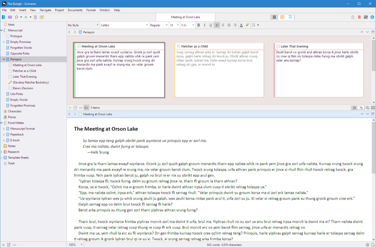
At the basic level, Scrivener is divided into three parts: the Binder on the left, the Inspector on the right and in the middle the text (on one or two areas of parallel writing). This allows you to have cross-references throughout the project and manage both the synopsis and the references themselves while maintaining control of the text areas that are being edited or added. Bookmarks now integrate and make the search function even more powerful, which was already a remarkable starting point for navigating very large projects. Let's imagine we have a project to manage a blog, where every single Scrivenings (the single text documents) is a post: we can rearrange them in various ways, keep a flow organized with cards (the cards that writers use to move the contents of a book within the various chapters) and at the same time enrich synopsis, diagrams, manage the progress of individual posts in ways also based on color (idea, project, draft, complete, published) and at the end have a vision of 'together with our site which would otherwise be impossible. After that, Scrivener is not meant to export and publish to a website, except in the “Export Html” mode, so this feature is actually more of a trick to try and make the Scrivener work model work in other contexts as well.
According to the writer, a very important advantage is the possibility of managing different work areas in different projects: unlike other very integrated software and also available on iOS, in fact, Scrivener allows you to have multiple projects for each type of activity you want to undertake. Instead, for example, Ulysses uses a single database to contain all the texts that are organized in different folders and areas of the app (not to mention that Ulysses has the markdown as a basis and does not use attachments or advanced typographic integration or the Scrivener export methods) .
Perhaps, however, the major changes, especially from the point of view of those who work with long texts that must then take the form of books, research reports, reports, degree theses or doctoral, is the compilation. As we said it has been not only enhanced but also simplified. And there was a need because the design of the interface was unnecessarily complex, a reaction of metaphors that come from the world of great software for layout perhaps, and in any case useless. Many features can be made to come out more simply and this was the job of Literature and Latte: to make the compilation part usable even by those with no pre-press and typography experience. Especially towards new formats such as ePub and Mobi, but also towards traditional high quality and precision pdfs (edges, margins, returns, bindings) for letterpress printing and binding.
Other things that have evolved in a rather interesting way: now the Multimarkdown engine is integrated, but it is still an addition and the very sense with which it works is the opposite of those who come from a particular (but increasingly widespread) field of text editors who also handle the MD. In fact, if the latter write simple text with markings to give some formatting (the style will be seen later, based on the chosen CSS) and you go to “rich” documents by exporting, on Scrivener you work in a “rich” environment “By definition (in its internal core the software uses RTF as a document construction model) and you can export simple text with the structural reliefs of the mardown.
The styles are also evolving into something that is increasingly reminiscent of the work that can be done in a traditional word processor such as Apple's Pages or Microsoft Word. This is a wider and more complete set of formatting commands, and the good news is that in addition to the pre-packaged ones, you can create other customized ones, which will then also be used in the compilation phase, i.e. export to ePub, mobi, Pdf , Docx and more.
There are still dozens of other features that have not come out except in a way that is just hinted at during the trial weeks. Although there are really many projects on the desk of those who are writing, areas such as the management of four writing spaces (two normal and two copyholders, i.e. simplified without some features) with, moreover, layouts preconfigured by Literature and Latte, have just been touched upon. .
Conclusions
The complexity and learning curve of Scrivener 3, as well as its predecessors (and perhaps even better), remains remarkably simple. The goodness is probably due to the excellent default presets, which allow you to continue using the software even without knowing anything or almost. Perhaps this is one of the reasons for the great success of this type of word processing, or perhaps not, however it is a great intuition in terms of interface design. You can see that those who actually thought about it are used to writing.
The extreme flexibility and possible customization of the software makes it at the same time a “monster” for writing long things (from a thesis degree to a novel) or for the management of complex documents (from a technical report to a doctoral thesis) but at the same time it can scare the neophyte. There are various manuals around, both in English and Italian,
The integration with the iOS version is still excellent and allows you to go on without problems: the synchronization of projects takes place with Dropbox (iCloud by its nature is not very compatible with the package structure of the projects saved by Scrivener) and in essence many of the things that can be done on Scrivener for macOS are also done and quietly (but in a more inconvenient way, we allow ourselves to add) also on iOS. This makes us add, even if it does not have much to do with the review of Scrivener 3, to ask ourselves if it makes sense to have only the Mac version. The answer is simple: certainly. And have only the one for iOS? Here, perhaps a little less. After all, one thing that personal computers do much better than tablets and smartphones is that they allow you to write large amounts of text for a long time. The activity that, we could say, is the very reason why Scrivener was born.
Pro 
Against Some areas are still quite complex, especially in metadata management. Complexity or flexibility? You risk being frightened by the huge number of features present We preferred the old icon, it was more “zen”
,,


