It's been a summer since Apple presented iOS 13 at WWDC 2019. The bravest among us – or those inspired by the business need to go and see what's around the next corner to tell readers – have installed it since first public beta. Gradually, one feature at a time, the new version of iOS has become more and more stable and more and more “drinkable”.
It is interesting to see and to tell in our contact that we like to imagine as an iOS 13 review that starts from a long experience of use and that if it really were a full review, it should end with the classic positive four-star rating. (not five because there are still some things to come with iOS 13.1)
The judgment is however positive: this is a step in the growth of the operating system of our mobile phones that is worth carrying out even if you have not new devices, because it simplifies, cleans up, offers more functionality. In short, to be installed.

What's inside iOS 13
The first thing you notice is obviously the lack of a lateral offset. Version 13 introduces various changes but, on the surface, it is basically the same as the previous ones. Many aesthetic changes are found with iPadOS more than with iOS 13, at least on the surface. But in reality, Apple has carefully revisited various seemingly secondary aspects of the interface to bring them all into alignment with a new style of sharing and using system resources.
Now it is shared with a different graphic hierarchy, with a new visualization that reorganizes in a functional way, for example the sharing of images, and with a series of small graphic novelties that in some cases are very large and perhaps make us glimpse style exercises that could transform into a new aesthetic.

There are also changes in Apple's stock applications. The most mature was Note, which remains essentially unchanged. Apple's Mail is enhanced, which acquires management screens increasingly similar to the system graphics (and creates some problems for example if you want to select everything that is unread in the spam folder: two taps were enough, now you need to new four).
And then there are the news of an enhanced Reminder app, which works as a team with localization and the address book, in addition to the new “Where is it”, which allows us to locate devices and friends in one fell swoop. Intriguing then the promise that all this will happen by minimizing the recognizability of individuals by Apple or others, consequently increasing the respect for privacy.
File management
The news does not end there. Because even for iPhone, as well as on iPadOS, a decidedly complete management of iCloud Drive finally arrives, with the possibility of analyzing the metadata of documents, seeing external memories, managing an iCloud archive locally. And now it's also possible to share iCloud folders with family, friends or collaborators.
But there are also other, more structural innovations. Apple has introduced the technology of Shortcuts, which are becoming very interesting features for Apple devices, because they are easy to create and can become the activation point for even rather complex activities and routines. They are a novelty that we will be able to see grow as we build a habit of producing this type of simplified script.
There is obviously the novelty of the dark mode, which introduces that dark interface that divides because it generates the enthusiasm of some and the complete rejection of others. A graphics mode that is still interesting because it is much less heavy for the eyes than the “all clear” ways of using the interface.

Do QuickPath
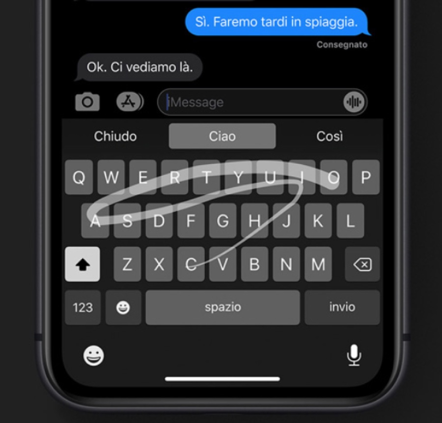
We have also seen and appreciated the keyboard with the “swipe” writing mode, well known in the Android world, because it is an enhancement of the writing possibilities. which thankfully does not compromise with the traditional writing method of Apple keyboards, including access to accented letters and special characters with a single click and swipe. Along with this comes a small package of shortcuts that can be executed with gestures that simplify – or at least make it less paradoxical – the use of cut, copy, paste and above all delete.
While the iOS 13 camera functionality marries the new iPhone 11 Pro while also adding the innovated software version, that's not the case with Apple's older devices, at least for now (we've seen with the definitive public beta, but maybe things will change with the updates of the official version) but the other news are there: both with Photos which now uses artificial intelligence locally, with attached privacy, which allows you to have simpler and more synthetic visions of large periods of your life in images, that for the editing management of both photos and videos that now acquire truly remarkable capabilities (and on the iPhone screen, however beautiful, they are certainly limited compared to what can be done on an iPad).

In conclusion
A lot could go on: management of zipped files, facilitation in the management of web sites for reading, new styles in emails via Mail, the Maps functionality enriched with directions inside international airports (especially in the USA) which allows a once Siri finds a plane ticket in the mail, in the Calendar or in the Wallet, to give information on the terminal and directions, or information on flight delays or cancellations.
Drawing the conclusions of the iOS 13 review is definitely easy. Is worth. Unless your phone can't upgrade due to hardware limitations, there really aren't any problems. Better to update, in our opinion.


